ISSWSH + Prosayla
Publication work for the scientists grew into a public brand for their patients: the research, name, identity, website, and CMS behind Prosayla.
Industry
Women's sexual health / medical education
Engagement
Medical illustration, then brand, digital, and event applications
Relationship
Scientific communication + public education brand
Status
ISSWSH illustration work published; Prosayla brand and original website completed
The work started in the journals.
ISSWSH works in a field where the information is specialized, personal, and often difficult to navigate. The first assignment was professional: medical illustration and process-of-care graphics for ISSWSH publications. The scientific and clinical content came from the physicians and researchers behind the work. Keeks’ role was to make that information visually legible through hierarchy, orientation, anatomical detail, and illustration. Keeks did not create the ISSWSH brand or website.
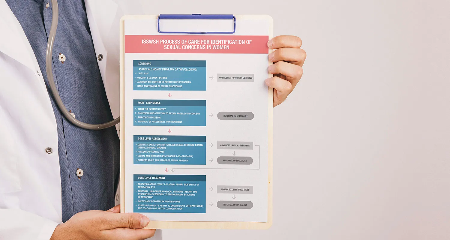
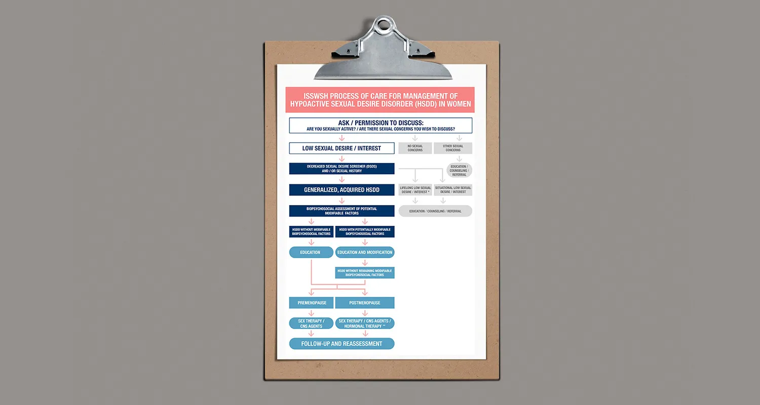
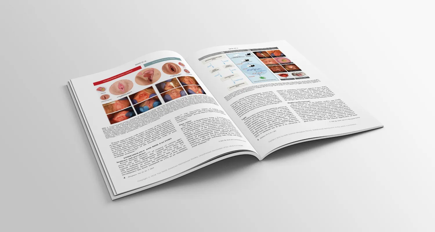
The figures had to hold up to clinical scrutiny.
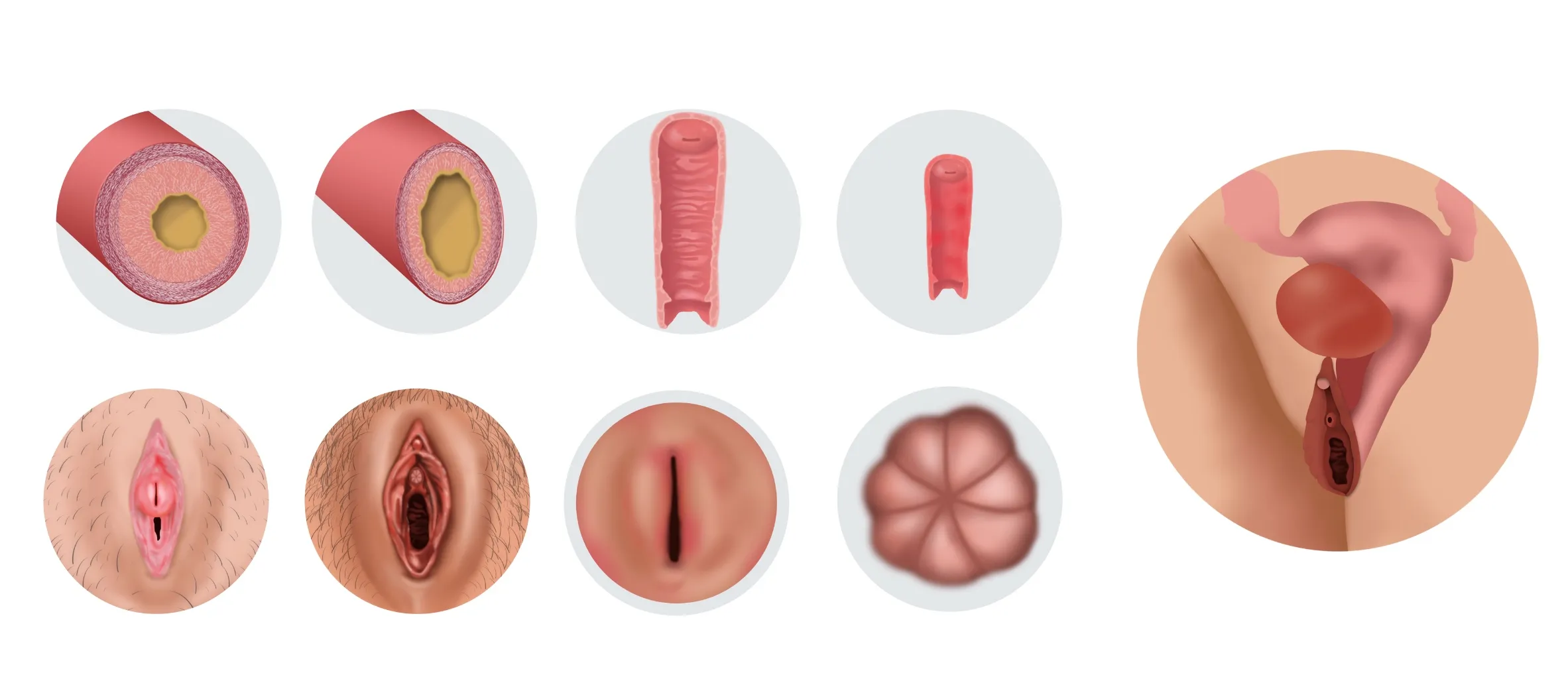
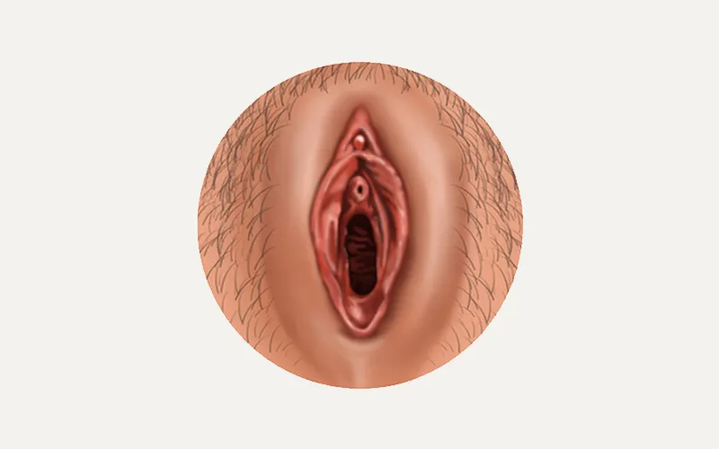
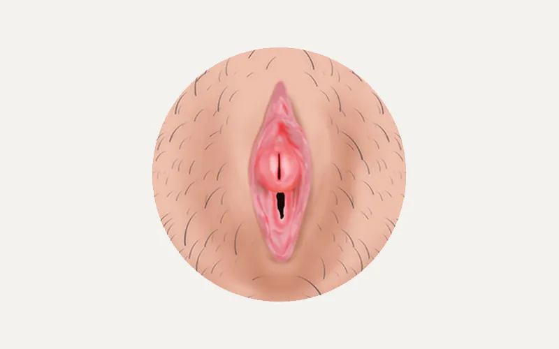
The anatomical work translated specialized subject matter into clear visual material for a professional audience: paired comparison views, cross-sections, and figures built for publication alongside the research they supported. Precision was the brief. A clinician reading these figures had to see exactly what the researchers meant.
Then the scientists wanted to talk to patients.
The publication work created the next assignment. ISSWSH wanted a public-facing education resource: a place where patients could find reliable information without reading a journal. That is a different communication problem. It needed its own name, its own voice, and an experience that felt neither institutional nor imprecise. Keeks started with market research into how the audience looked for this information and what already existed, then created the Prosayla name, logo, identity, and brand voice.

The website became the public way into the subject.
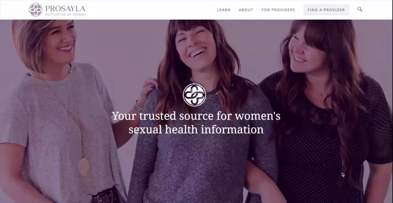
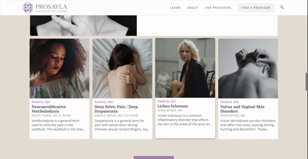
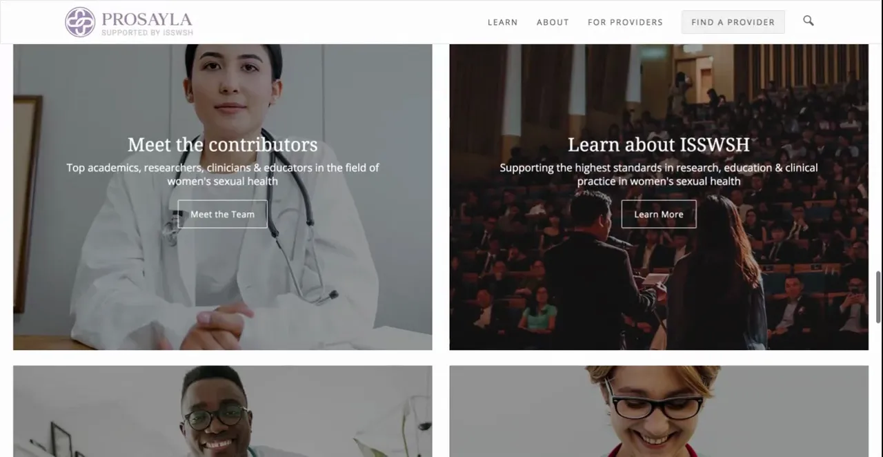
Keeks designed and developed the original Prosayla website as the brand’s digital home, bringing together educational content, contributor profiles, provider discovery, and its connection to ISSWSH. We built it on a CMS so the ISSWSH team could add new, medically reviewed articles without a developer. The identity, language, and site structure were designed as one experience rather than separate brand and web projects. Keeks does not currently maintain or manage the Prosayla website.
The brand left the screen.
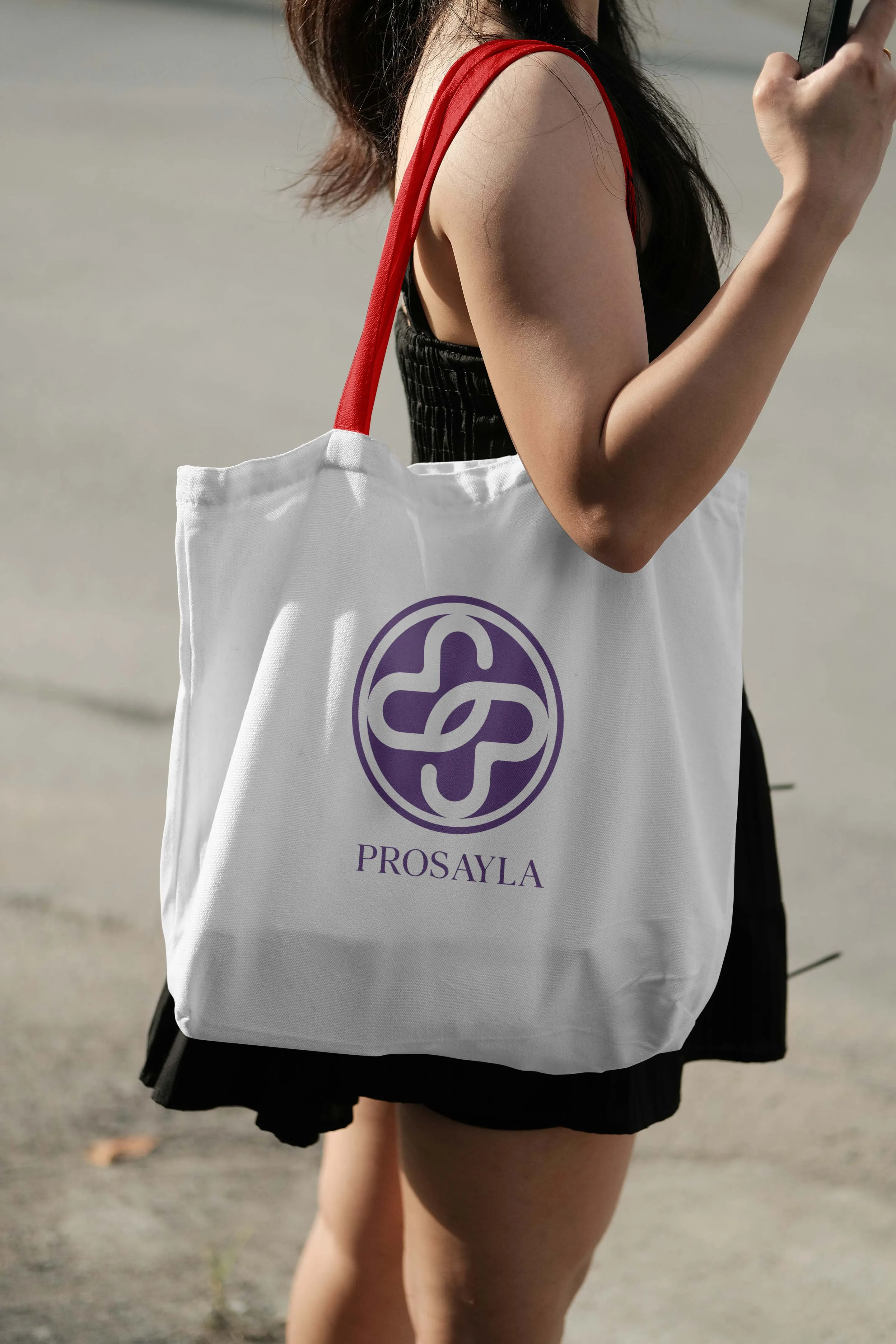
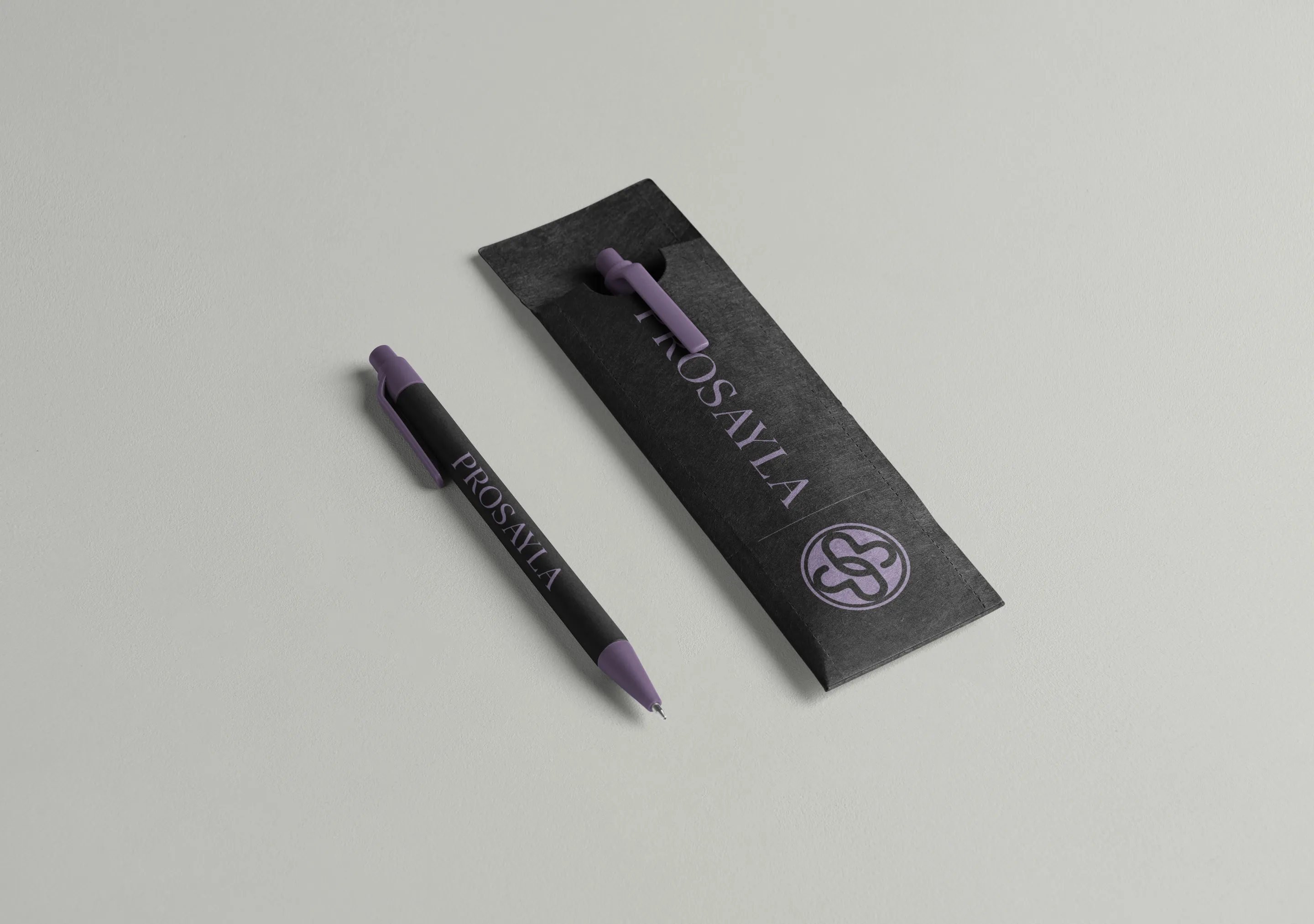
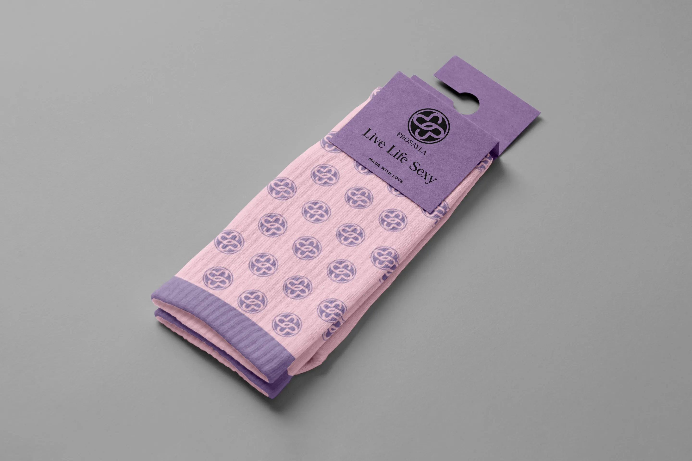
Prosayla also had to exist in rooms: at meetings, at events, in the hands of the providers and patients it was built for. Keeks carried the identity into event and meeting materials and merchandise, a public-facing brand that could sit alongside the expertise behind it without looking institutional.
Same expertise. Different communication.
The subject connected the work. The audience determined what Keeks needed to build. For the scientists, figures and flowcharts precise enough to publish. For their patients, a name, a brand, and a website plain enough to trust.