← Our work

Amanetania

Building the brand, story, website, and public presence for a wilderness education program.

Industry

Outdoor wilderness & experiential education

Engagement

Brand, website, content & campaign

Relationship

Defined project, delivered and handed off

Status

Brand and digital system delivered; the program has since closed. Shown as designed and built during the engagement.

Scope

Brand strategy, identity, brand story, content writing, website design and development, marketing, advertising, print materials, apparel, vehicle graphics, and physical brand applications
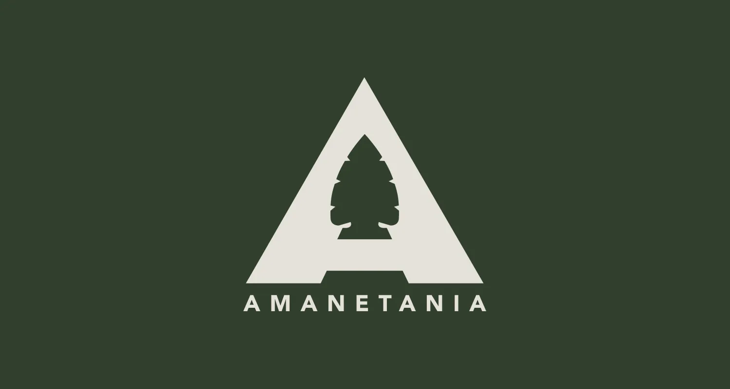
The Amanetania identity: a triangular A drawn as an arrowhead with a pine tree cut out of its center, the name set beneath it, in cream on forest green
New identityA complete visual system built around the program
Story + contentBrand narrative and website and marketing content written by Keeks
Website designed + builtA digital experience created around the program and its purpose
From screen to fieldCampaign materials, apparel, vehicle graphics and physical applications

The program was already real. The way it showed up needed to catch up.

Amanetania was already running outdoor wilderness and experiential-learning programs when Keeks became involved. The experience had a clear purpose; the brand and website did not yet communicate it.

Keeks rebuilt the public-facing system around the program: identity, story, written content, website, marketing and advertising, then carried the same language into print, apparel, vehicle graphics, and other physical applications.

Amanetania owned and operated the education program. Keeks built the brand, content, digital experience, and customer-facing creative system around it.
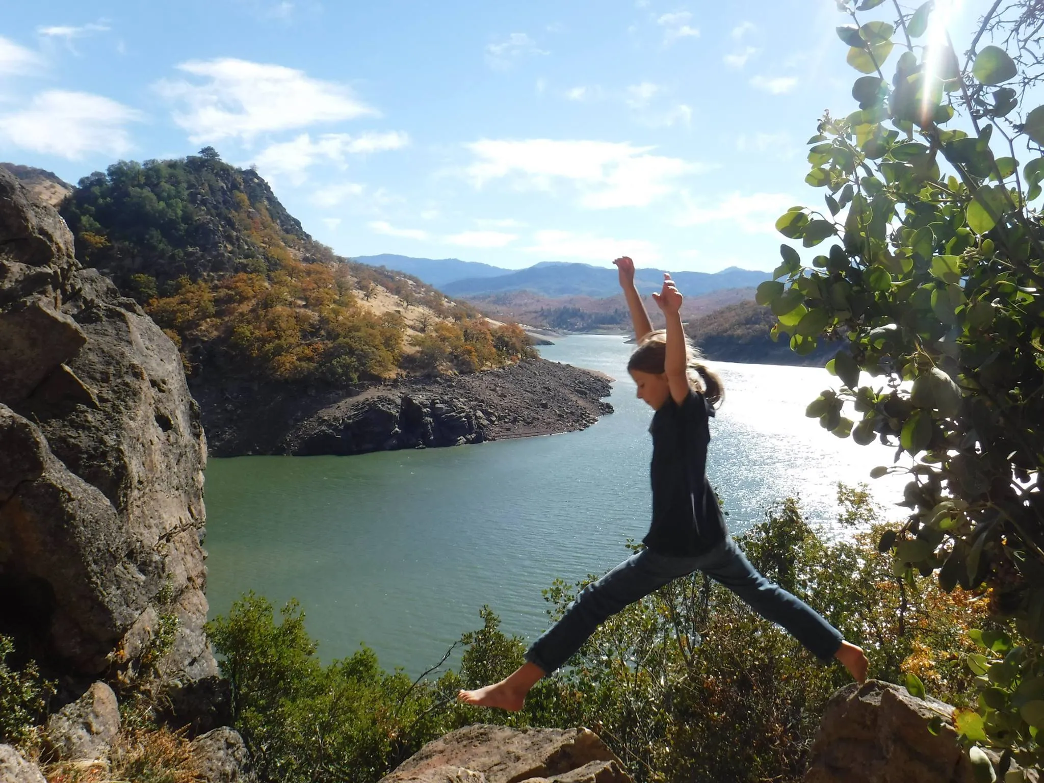
A participant standing with arms raised on rocks above a reservoir, oak-covered ridges behind

One program, made recognizable across every place people encountered it.

  1. 01The programAn existing wilderness-education experience with a clearer story to tell.
  2. 02The identityA visual system built to make the organization recognizable.
  3. 03The storyBrand language and content developed around the purpose and experience.
  4. 04The public experienceWebsite, campaign, advertising, apparel, vehicle graphics and physical applications.

The identity needed to feel connected to the environment without disappearing into it.

Keeks created the Amanetania identity around a simple geometric mark and a natural visual system that could move between program materials, digital experiences, apparel, and the physical world.
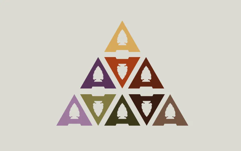
The Amanetania colorway system: nine versions of the triangular A mark in ochre, rust, plum, olive, moss, brown and lilac, arranged together into one larger triangle
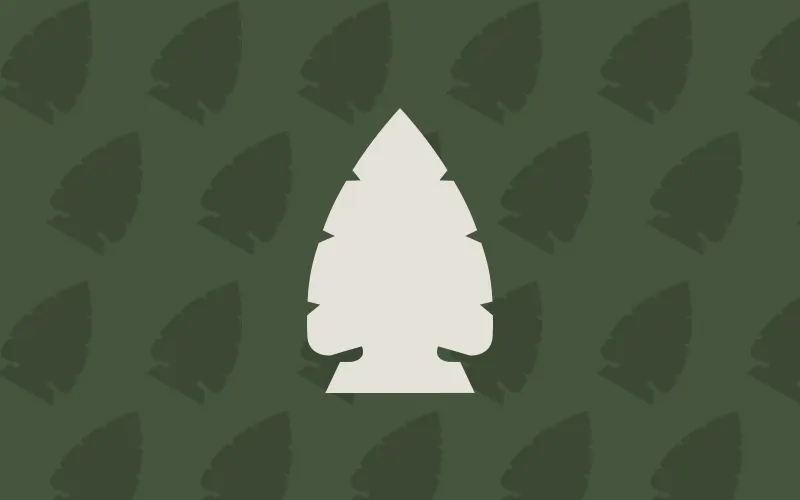
The brand pattern: the arrowhead and pine-tree symbol repeated across a forest-green field with one cream symbol standing forward

The brand needed words, not just a mark.

Keeks developed the brand story and wrote the content that explained what Amanetania was, who the program was for, and what participants would experience. That writing became part of the website, the marketing materials, and the wider public-facing brand.
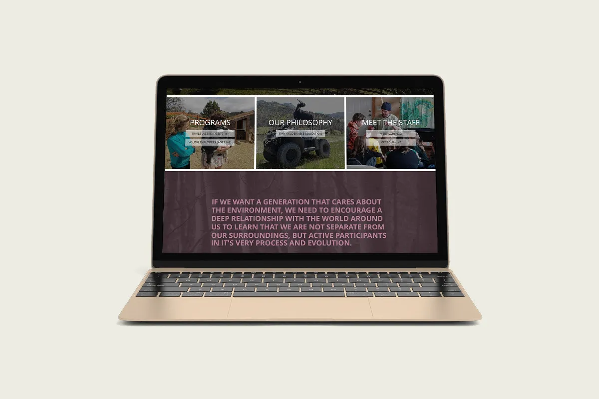
The website on a laptop: three linked sections for Programs, Our Philosophy and Meet the Staff above a full-width written statement about encouraging a deeper relationship with the world around us

The website became the clearest expression of the new brand.

Keeks designed and developed the Amanetania website, bringing the identity, photography, program information, and written story into one digital experience.
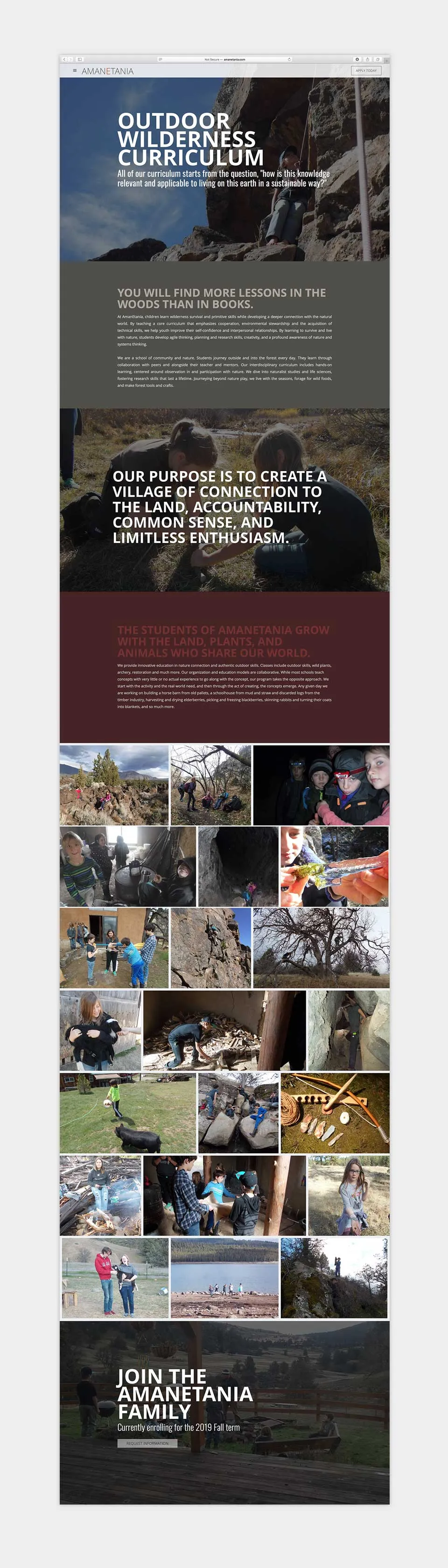
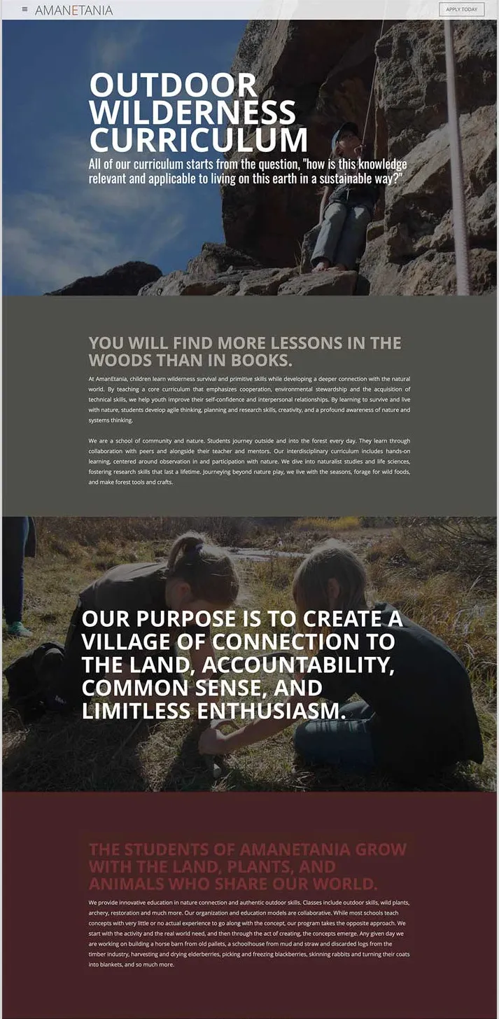
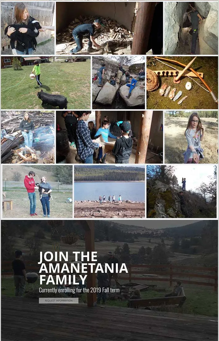
A full scroll of the Outdoor Wilderness Curriculum page: a photographic header, alternating written statements about lessons in the woods and the purpose of the program, a grid of program photographs, and a closing invitation to join the Amanetania family
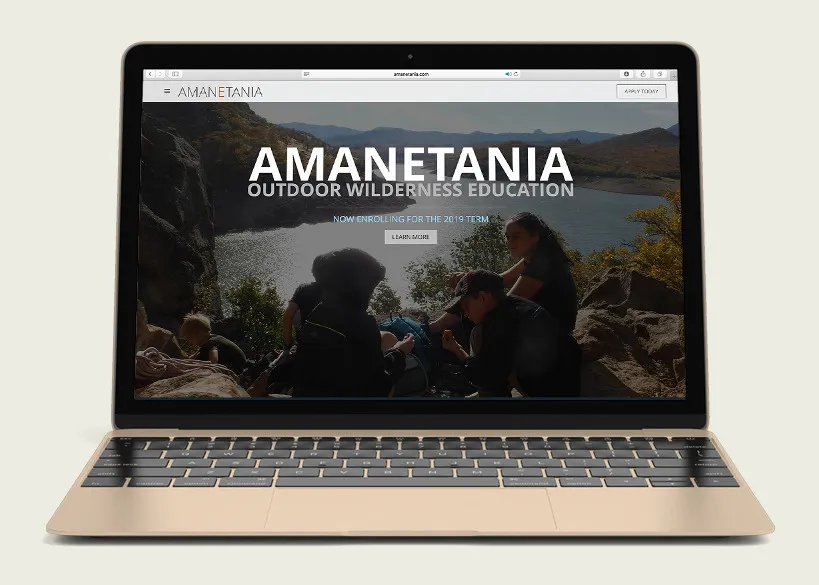
The Amanetania website home on a laptop: participants sitting on a rock ledge above a lake, with the Amanetania name and the line Outdoor Wilderness Education across it
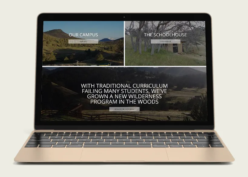
A website section on a laptop: linked panels for Our Campus and The Schoolhouse above a written statement about growing a new wilderness program in the woods
The upper half of the Outdoor Wilderness Curriculum page: the site header, the curriculum statement over a climbing photograph, a written block headed You will find more lessons in the woods than in books, the purpose statement about creating a village of connection to the land, and a block about students growing with the land, plants and animals
The lower half of the same page: a grid of program photographs showing animals, fire-building, woodwork, climbing and lake trips, above the closing panel inviting visitors to join the Amanetania family

The same story had to work outside the website.

Keeks extended the brand into marketing, advertising, print materials, and campaign communication, keeping the message and visual system recognizable as the format changed.
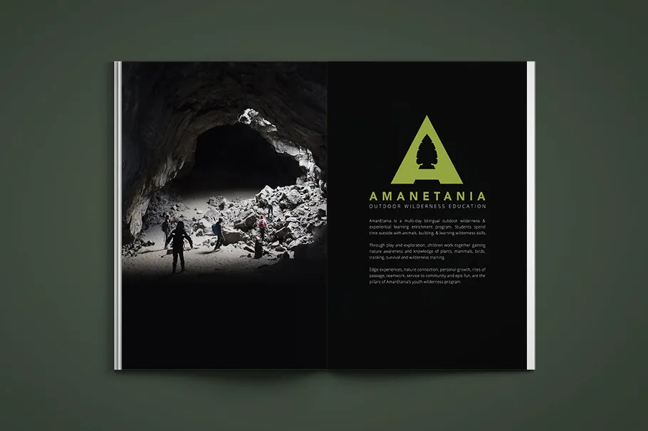
A printed spread: a cave-mouth photograph across the left page and the mark in bright green with the program description on the black right page
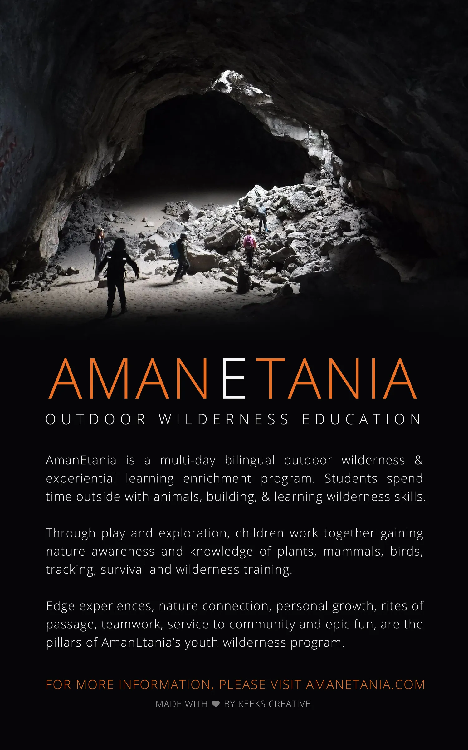
The full-page advertisement: participants small inside a vast cave mouth above the Amanetania name, the line Outdoor Wilderness Education, three paragraphs describing the program, and a closing line crediting Keeks Creative
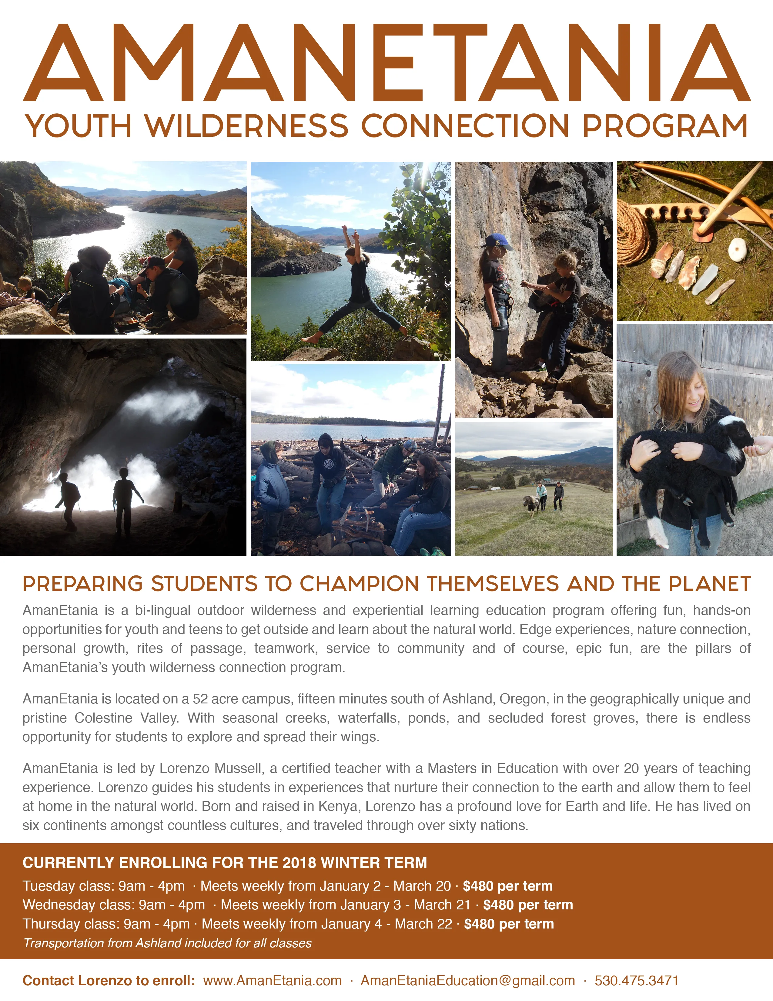
The youth wilderness connection program flyer: the Amanetania name across the top, a grid of nine program photographs, the headline Preparing students to champion themselves and the planet, three paragraphs about the program and its campus, and the enrolling term details and contact information

Then the identity moved into the physical world.

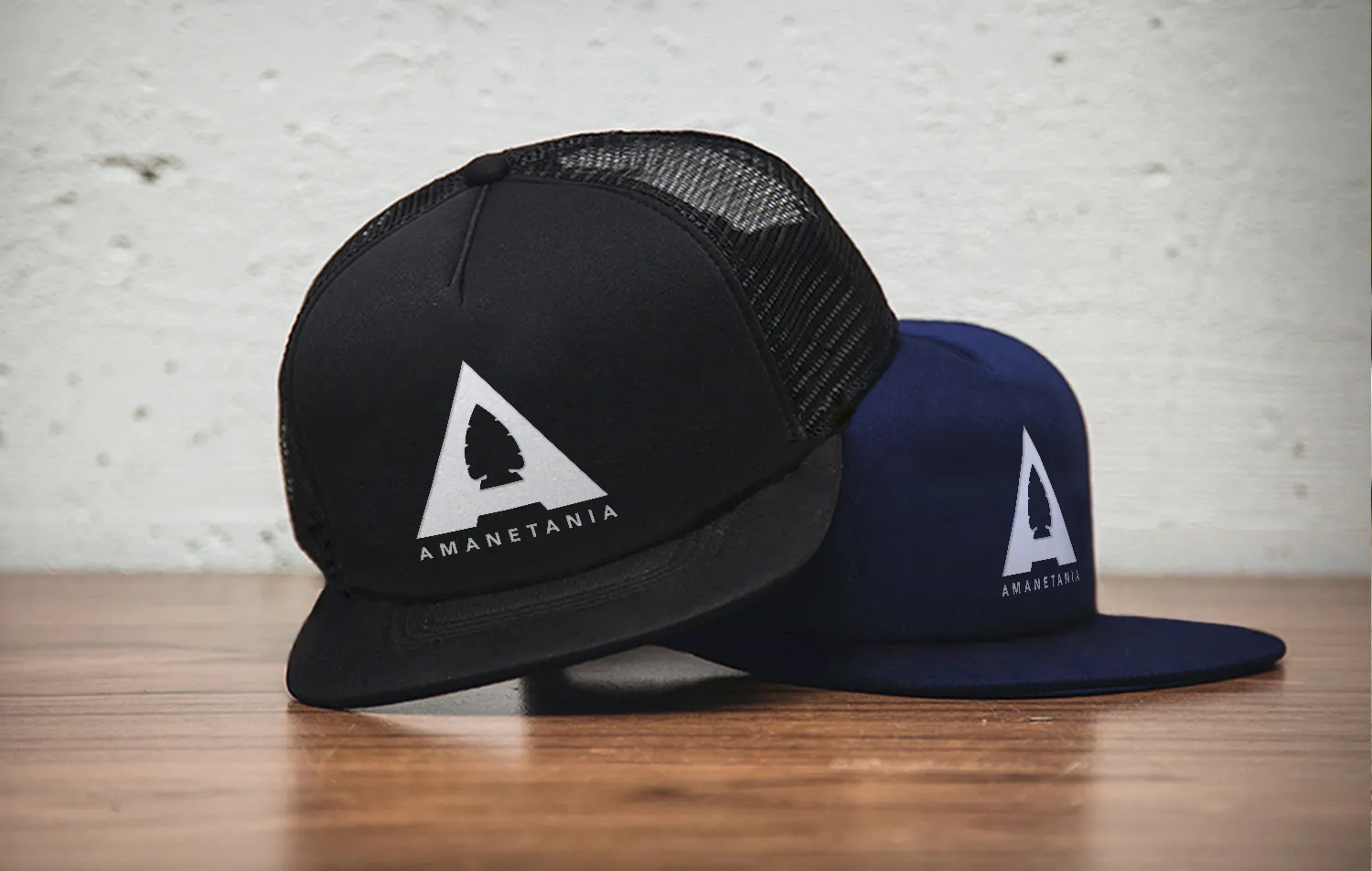
Vehicle graphics, apparel, bags, hats, and other applications carried the Amanetania identity into the places where the program actually operated and met its community.
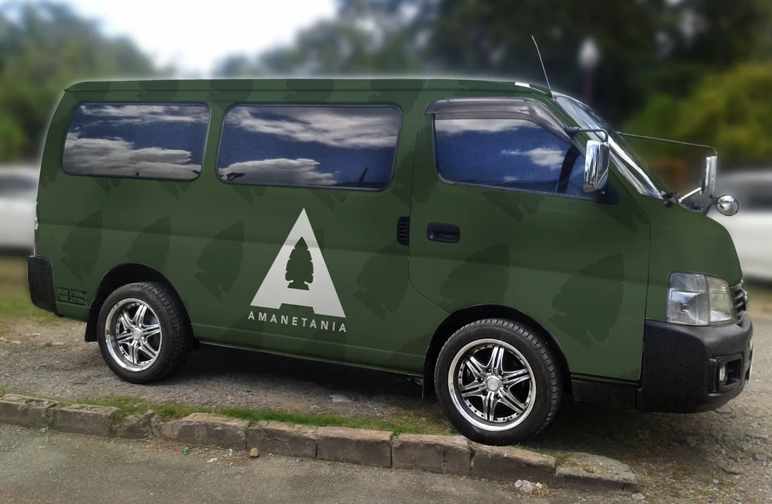
A van wrapped in forest green, the arrowhead pattern running across its panels and the Amanetania mark on the side
Two caps, one black and one navy, each carrying the Amanetania mark in white
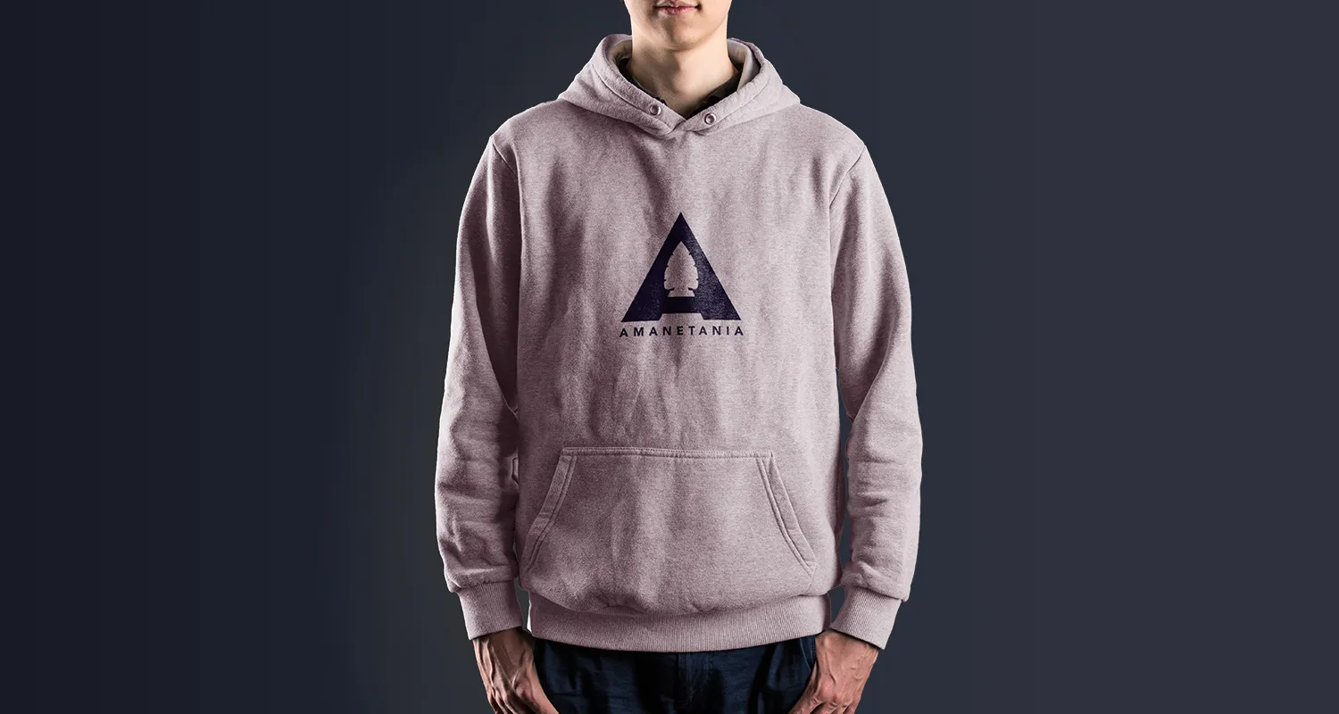
A heather hoodie worn with the Amanetania mark printed across the chest
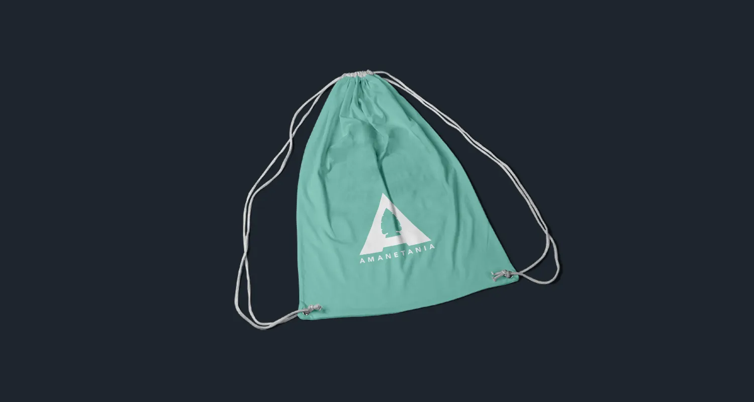
A green drawstring bag carrying the Amanetania mark in white

One program. One recognizable public identity.

Keeks rebuilt how Amanetania looked, sounded, and showed up, then carried that system from the website and campaign materials into apparel, vehicle graphics, and the physical world around the program.

The engagement was a defined project, and it ended as one. Amanetania has since closed. The work here is shown as it was built, from the identity to the van that carried it.
Selected work

Inside the work.

Tell us what you need. We’ll take it from there.

One conversation answers three questions: what it takes, what it costs, and whether we’re the right team. You commit to nothing.

Start a conversation