Rise Ashland
Building the brand, website, and launch foundation for a new practice, then staying with it for more than two years.
Industry
Chiropractic / wellness / healthcare practice
Partnership
More than two years
Relationship
Launch and ongoing creative partner
Status
Practice launched and operated; it has since closed. Shown as designed and built during the partnership.
Scope
Brand strategy, identity, brand voice, website design and development, signage, marketing materials, meeting and convention materials, apparel, physical brand applications, and continued creative support
The name and space were already there. The public-facing practice was not.
Rise Ashland was preparing to open with a name, a physical space, and a clear idea for the kind of practice it wanted to become. What it did not yet have was the identity, public story, website, or customer-facing materials that would introduce it.
Keeks built that launch foundation, then stayed involved for more than two years as the work expanded into marketing, signage, meeting and convention materials, apparel, print, physical brand applications, and continued creative support.
Rise Ashland built and operated the practice. Keeks built and supported the brand, website, public story, and customer-facing creative around it.
From a name and a space to a complete practice brand.
Four stages show how a name and a space became a brand, a website, a launch, and more than two years of continued creative work. Each stage built on the one before it.
- 01The startA name, a physical location, and an early vision for the practice.
- 02The brandPositioning, identity, voice, visual language, and public story.
- 03The launchWebsite, signage, marketing, and customer-facing materials.
- 04The continued workMore than two years of brand applications, campaigns, apparel, print, and creative support.
The practice needed a point of view before it needed promotion.
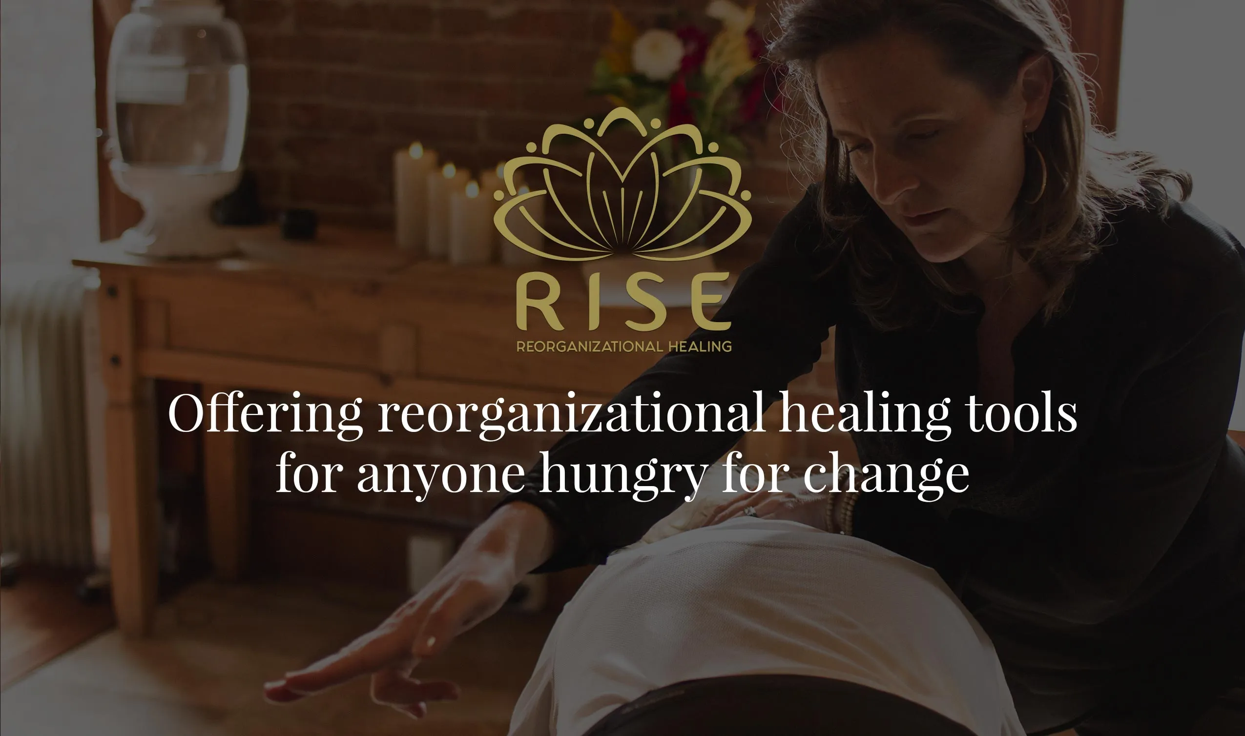
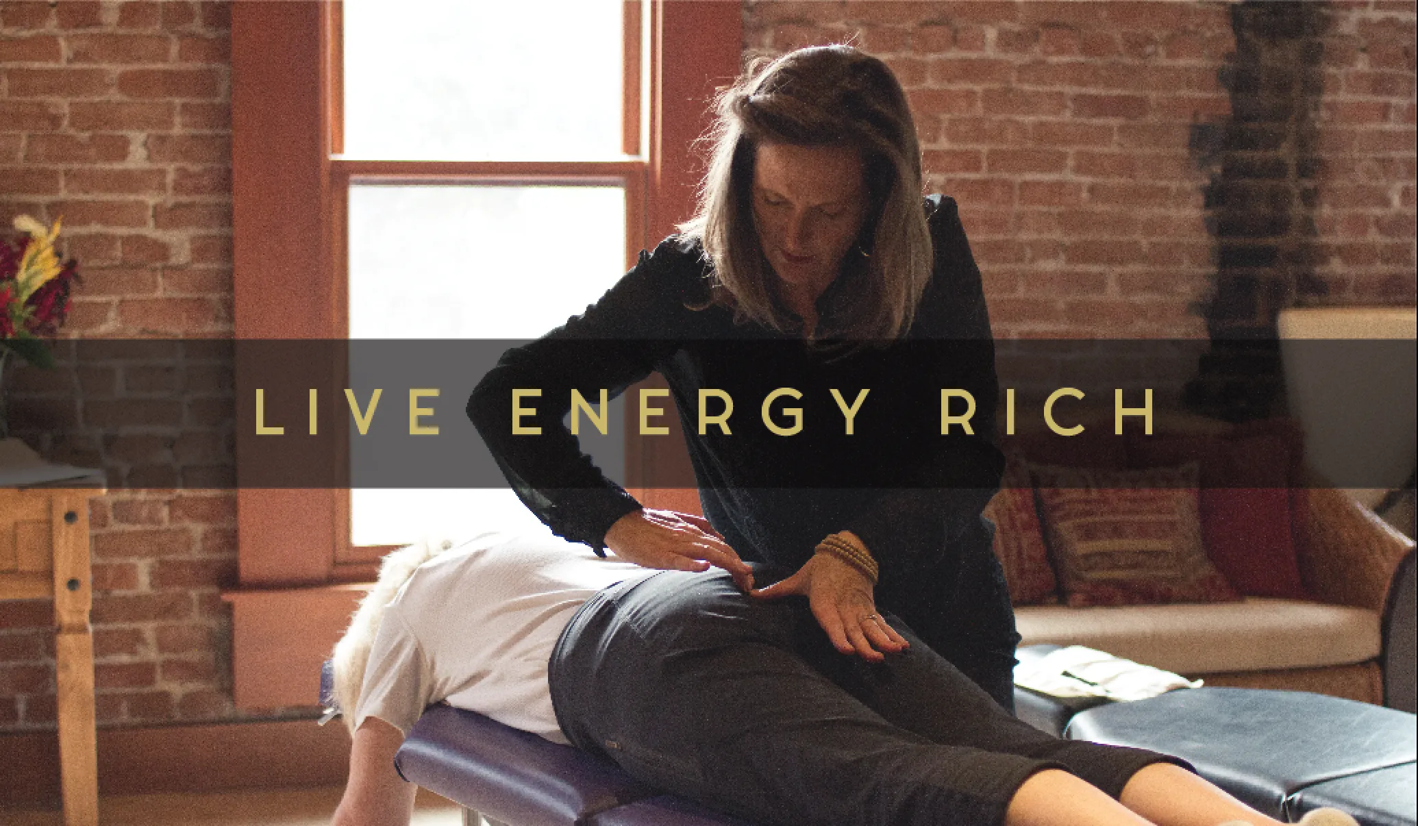
Rise was built around the idea of an energetic, optimistic approach to health and wellness. The brand needed to express that energy without disappearing into generic wellness imagery.
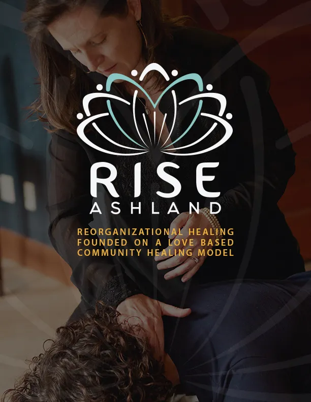
Keeks developed the positioning, logo, visual language, brand voice, and public story. Vibrant color, movement, and layered graphic details became the foundation for everything that followed.


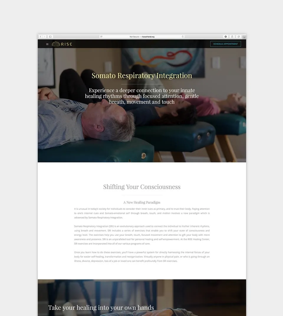
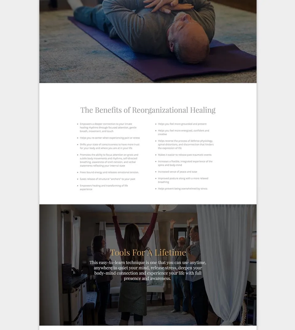
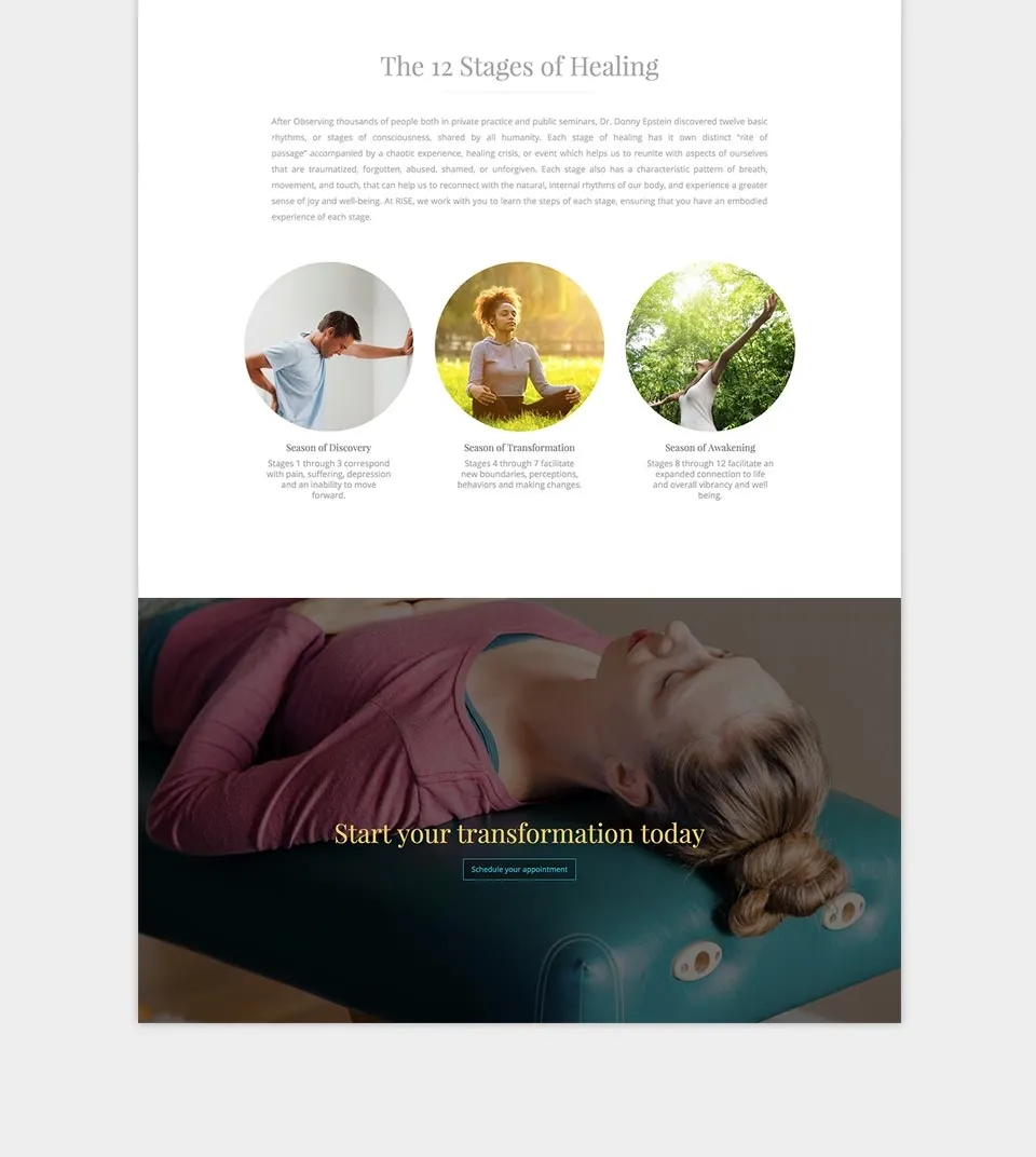
The website introduced Rise before the doors opened.
Before launch, Rise needed a public presence that could explain the practice, establish its tone, and give prospective patients a clear way to understand and contact the new business.
Keeks designed and developed the website, carrying the identity, voice, imagery, and practice story into the digital experience.
The brand had to work in the everyday details.
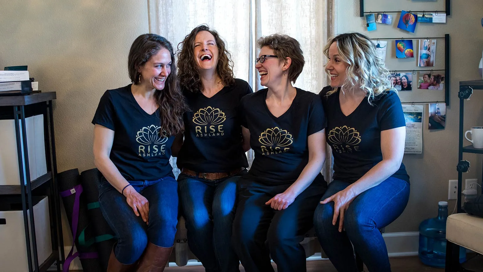
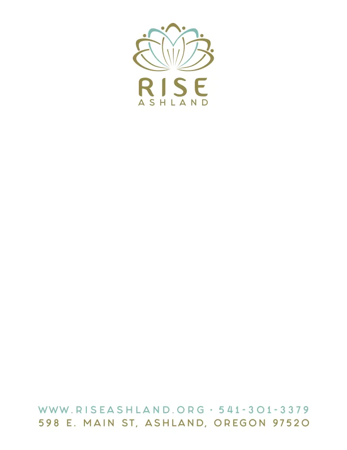
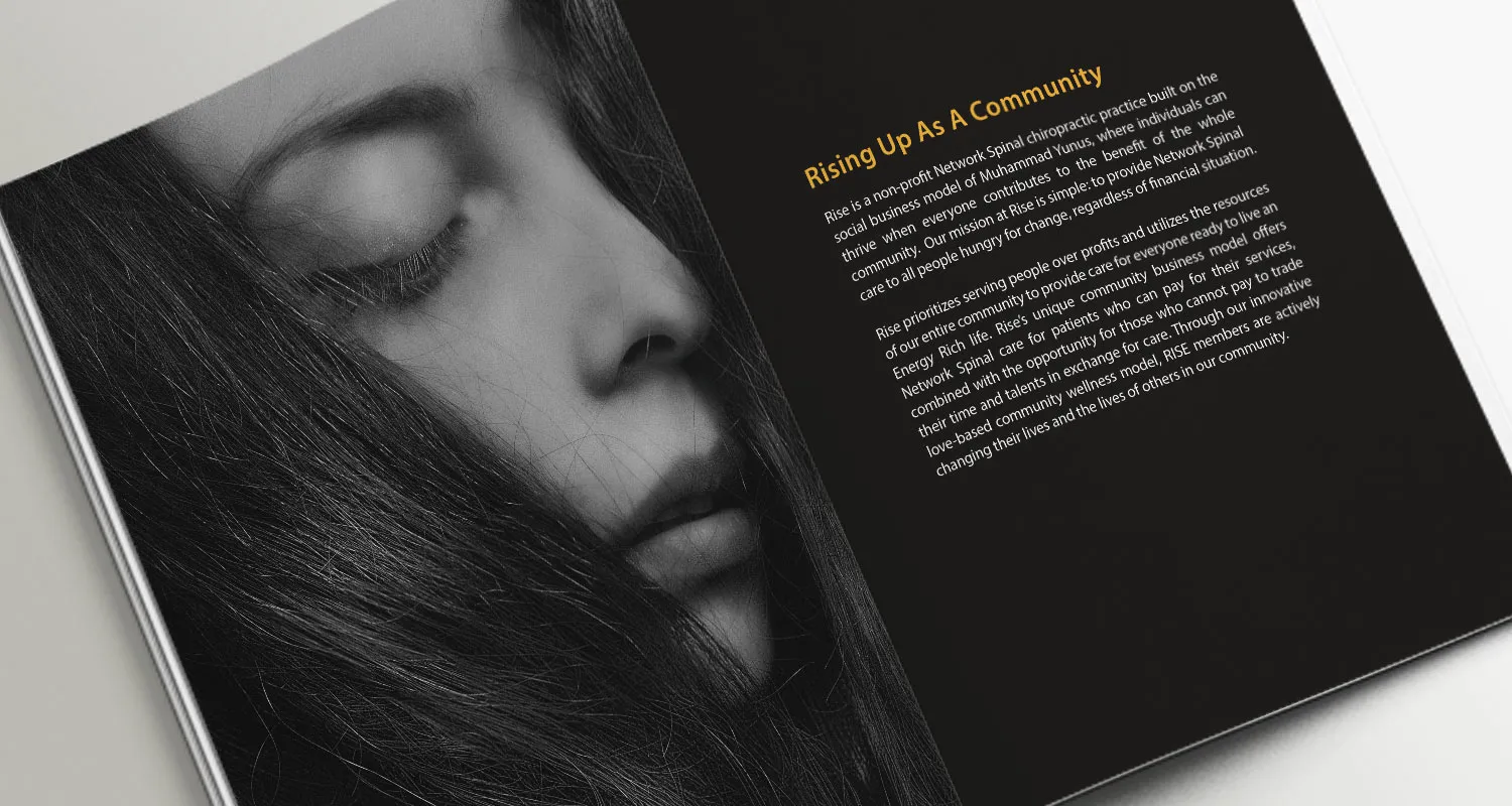
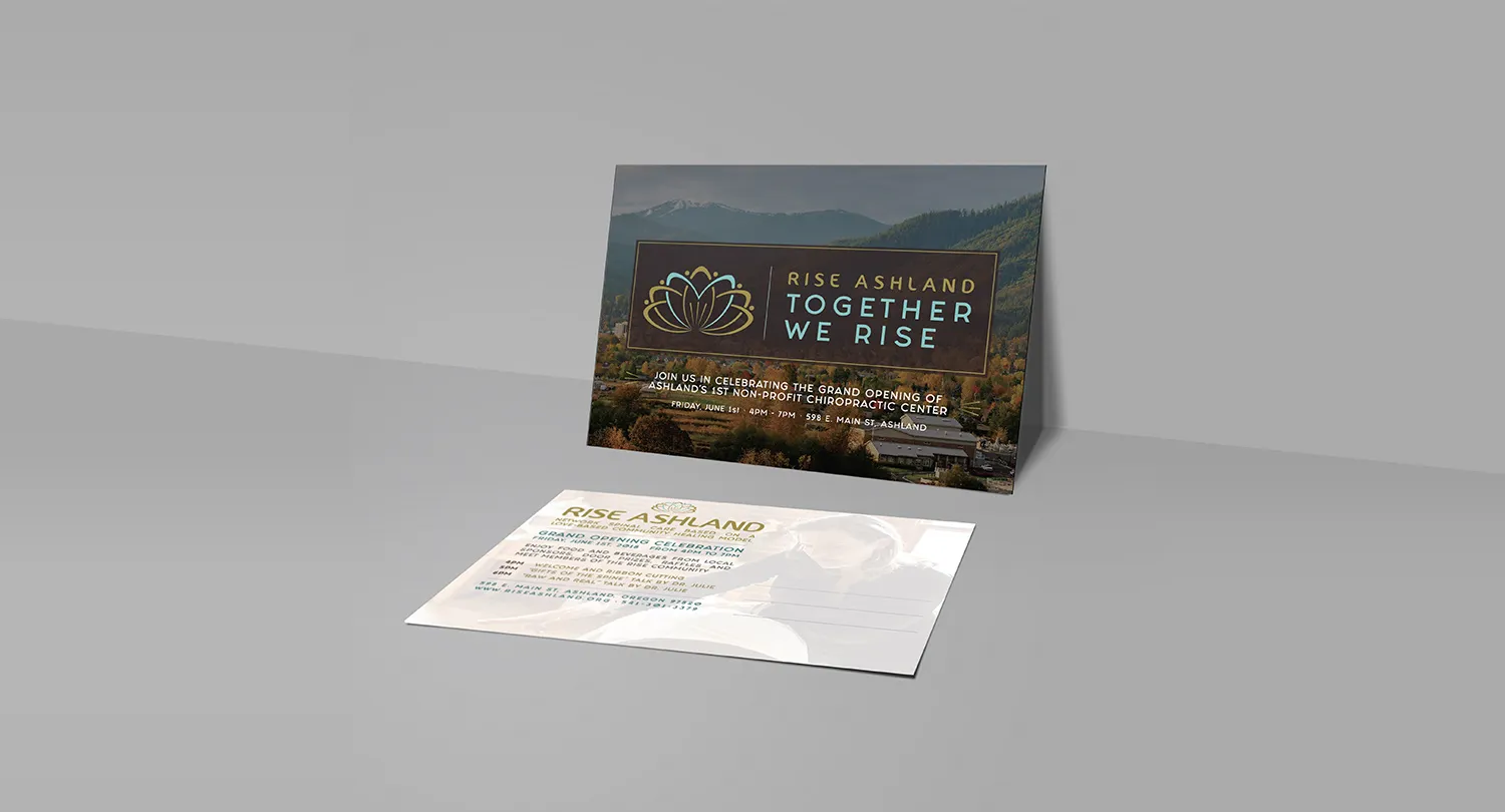
A new practice needed the identity to function beyond the website. Cards, letterhead, prescription materials, brochures, postcards, envelopes, and other pieces all had to feel like part of the same place.
Keeks extended the visual system across those materials so routine patient-facing pieces carried the same voice and visual language as the launch.
The identity moved into the physical practice.
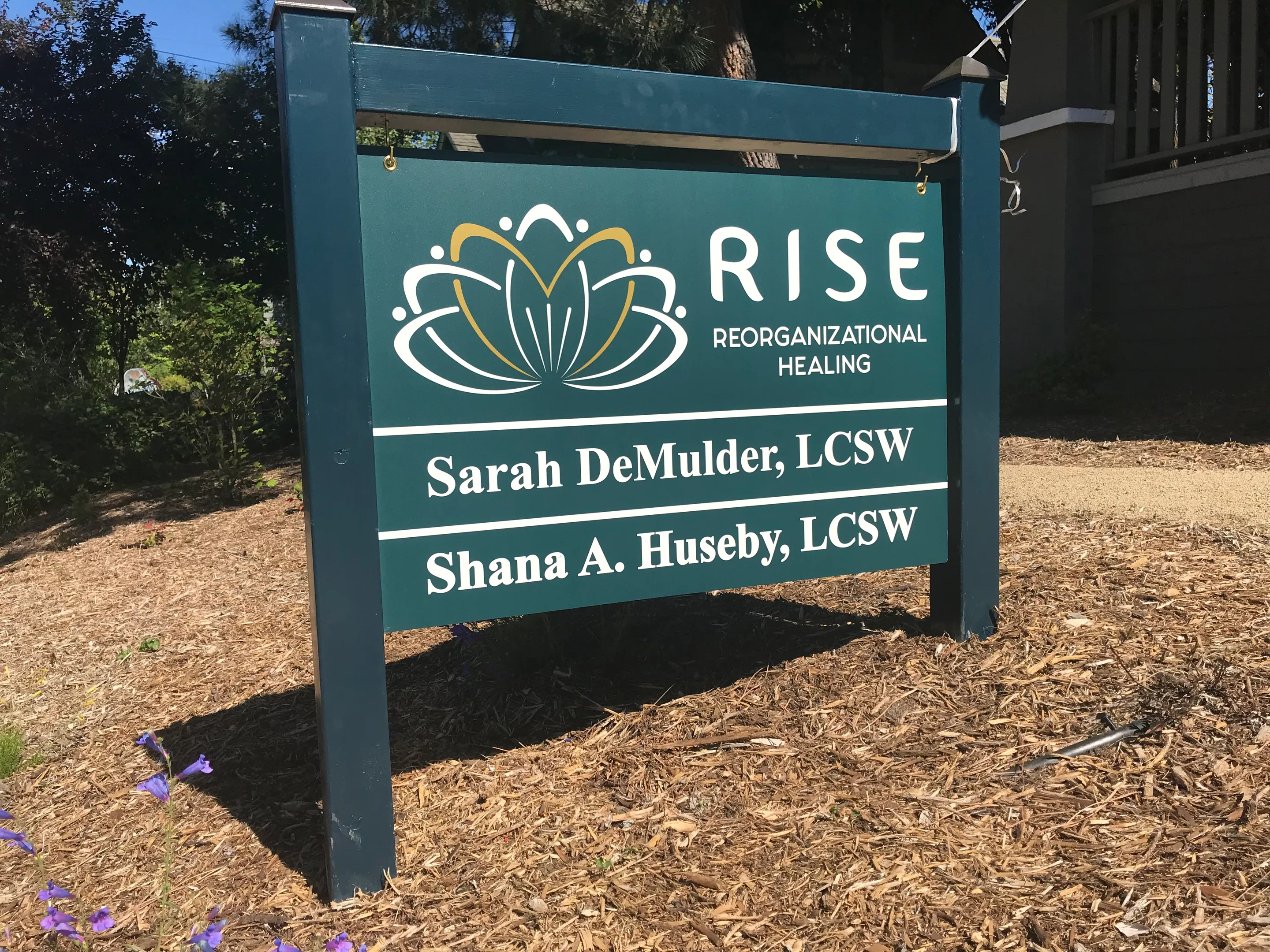
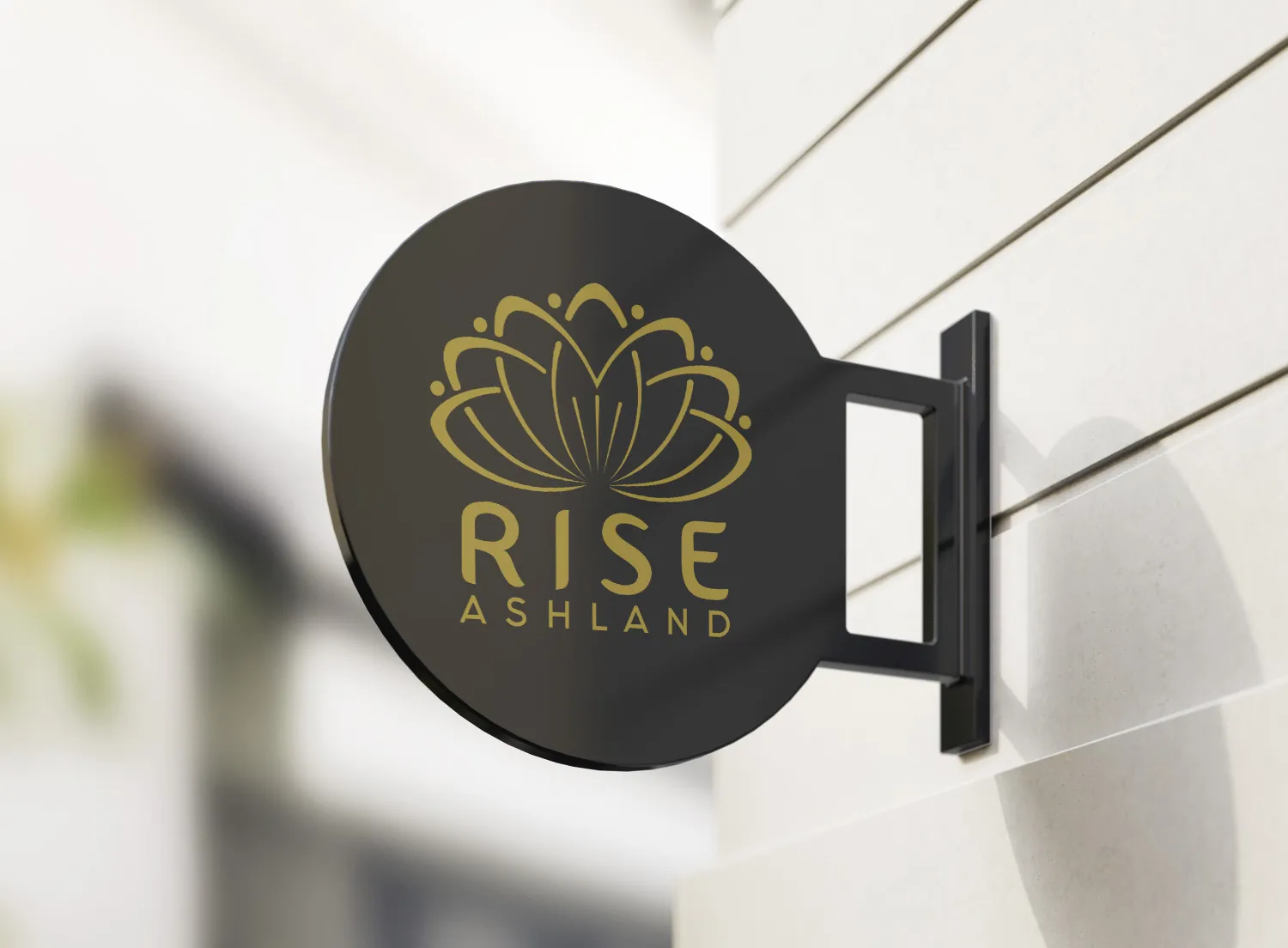
Keeks designed signage and physical brand applications that carried the Rise identity into the space itself.
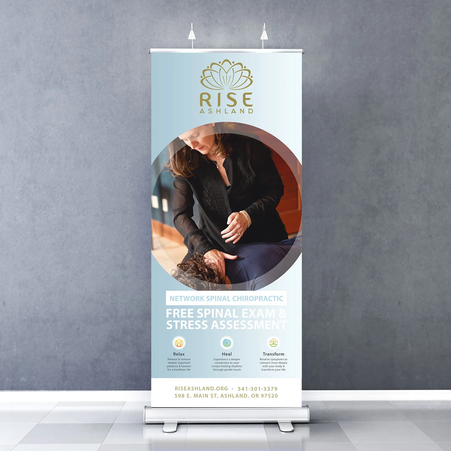
The same visual language also extended into roll-up displays and meeting or convention materials, giving Rise a consistent presence outside the practice.
Launch was the beginning of the relationship.
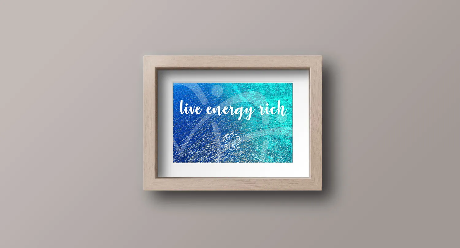
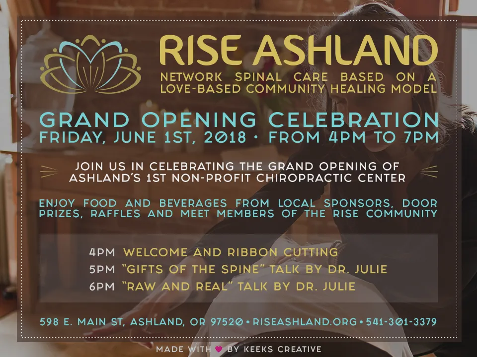
After opening, the work continued as Rise needed new marketing materials, campaigns, print pieces, apparel, product applications, and other creative support.
Across more than two years, Keeks continued carrying the original brand into new needs without rebuilding the identity each time something changed.
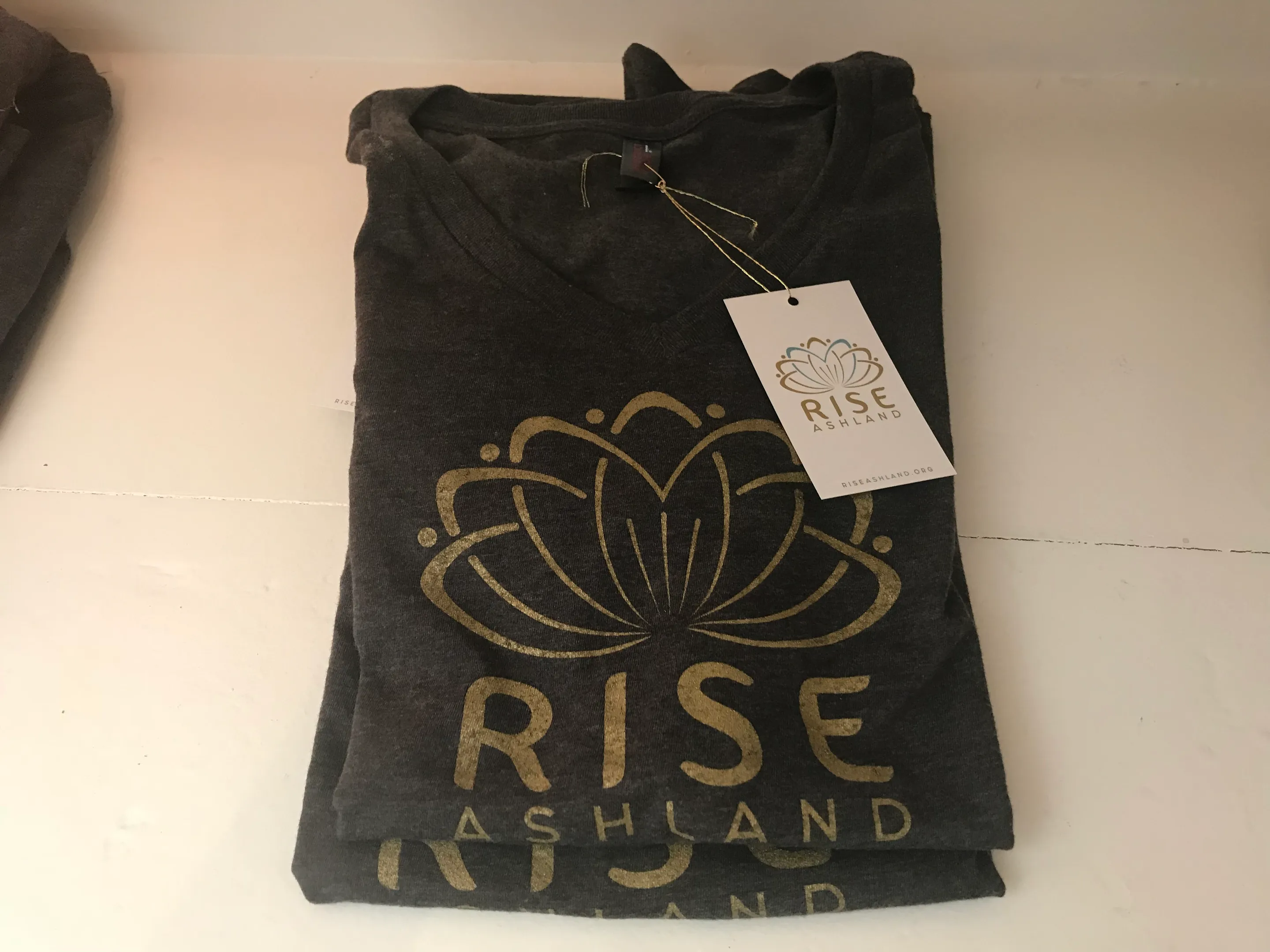
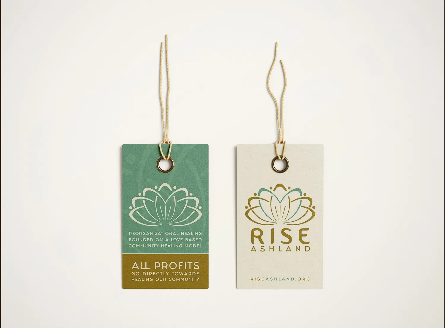
The same language carried into what people could wear and hold.
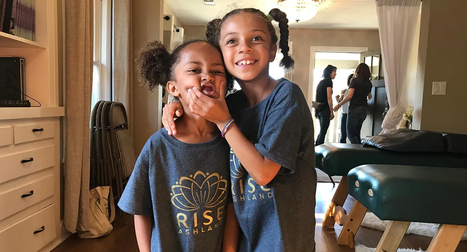
Apparel, clothing tags, and other physical brand pieces extended Rise beyond printed communications and into objects used around the practice.
Built for launch. Extended for what came next.
Rise Ashland began with a name and a physical space. Keeks built the identity, website, public story, and launch materials around them, then continued supporting the brand for more than two years.
The work expanded because the next need was connected to the one before it: signage, marketing, print, meeting materials, apparel, and physical applications all carried forward from the same foundation.
Rise Ashland has since closed. The work here is shown as it was built, from launch through more than two years of a practice in daily use.