Jiu Jitsu Foundation
Building a distinctive academy identity across screen, space, apparel, and training gear.
Industry
Brazilian jiu-jitsu / martial arts academy
Engagement
Brand identity, website & physical applications
Relationship
Defined project, delivered and handed off
Status
Brand and website delivered; academy remains active
Scope
Identity, website design and development, signage, apparel, patches, products, certificates, and academy brand applications

The category was visually crowded. The academy needed a mark of its own.
Brazilian jiu-jitsu academies often draw from the same visual vocabulary: shields, fists, flags, animals, crests, and aggressive type. Jiu Jitsu Foundation needed to feel credible inside the culture without looking interchangeable with the academies around it.
Keeks created the identity, then carried it into the original website, signage, apparel, patches, products, certificates, and physical academy. The mark needed to remain recognizable whether it appeared on a storefront, a gi, a shirt, a certificate, or a digital screen.
Jiu Jitsu Foundation built the academy, coaching, curriculum, and training experience. Keeks built the brand system around them.

From a mark to a complete academy identity.
Four stages show how a single identity challenge grew into a website, physical applications, and a mark the community adopted. Each stage built on the one before it.
- 01The categoryA visually crowded martial-arts landscape.
- 02The markA distinctive identity designed for screen, apparel, and physical space.
- 03The academySignage, storefront, training-space applications, certificates, and branded materials.
- 04The applicationsGis, patches, shirts, staff apparel, products, and training gear.
The mark had to feel credible without becoming another martial-arts cliché.
The identity needed enough strength for a Brazilian jiu-jitsu academy without relying on the same visual shorthand used across the category.
Keeks developed the logo, typography, color, and application system so the mark could remain recognizable across digital use, signage, apparel, patches, certificates, and products without becoming ornamental or overworked.


The brand moved into the academy.
The identity had to work where Jiu Jitsu Foundation actually operated: on the building, around the training space, on walls, signage, mats, certificates, and the materials people encountered inside the academy.
Keeks extended the system into the physical environment so the storefront, training space, and branded materials felt like one connected place rather than separate applications of a logo.
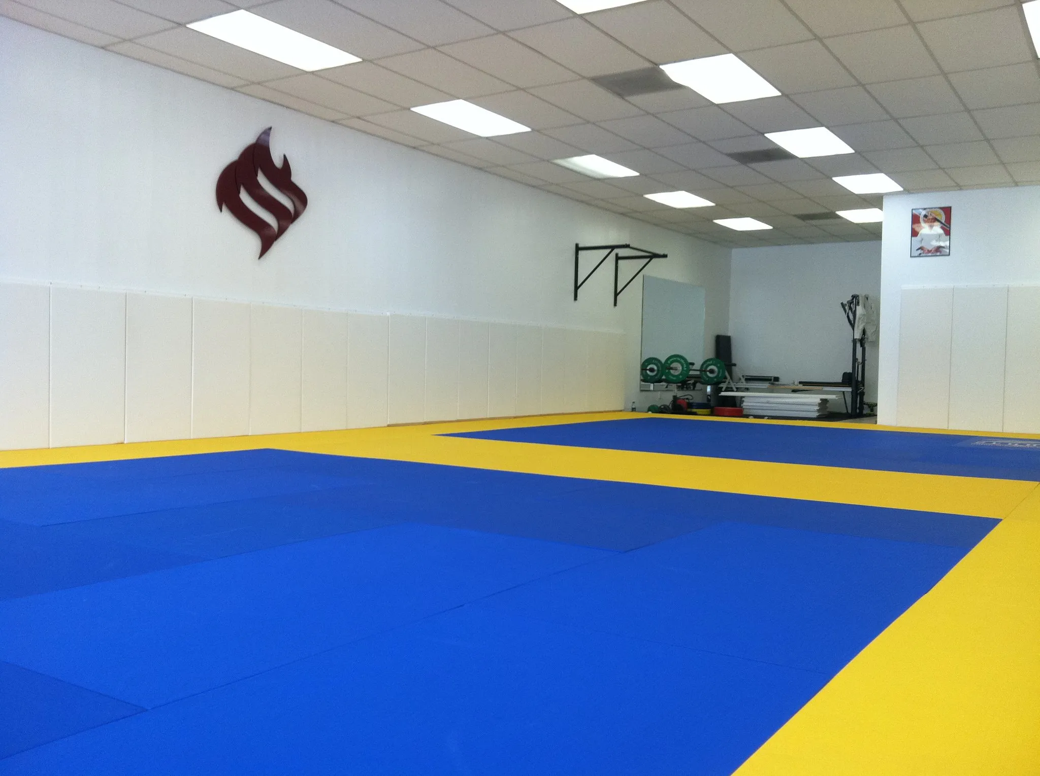


The mark had to work in motion.
A martial-arts identity spends much of its life on people and training gear rather than on a static page.
Keeks adapted the identity across gis, patches, shirts, staff apparel, and other academy gear so the mark stayed clear at different scales, on different materials, and in active use.




The system held together in use.
The identity appeared across classes, ceremonies, instructors, students, academy materials, and branded gear without needing a different visual treatment for every setting.
The same mark stayed recognizable whether it was seen on the building, on a gi, in a class photograph, or on academy materials.

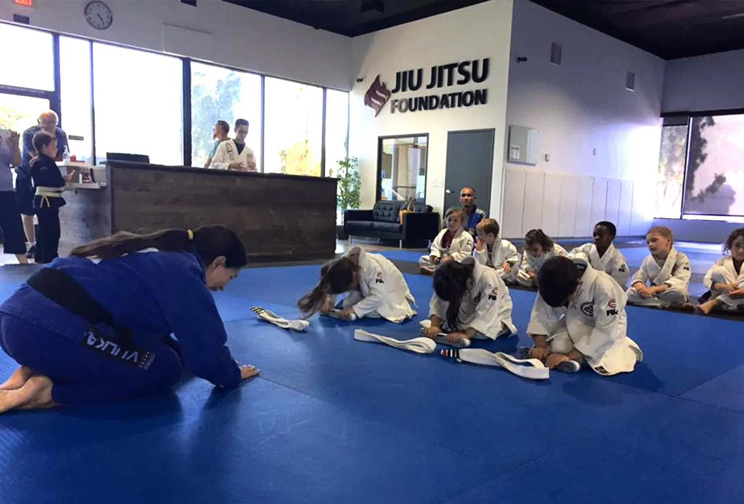
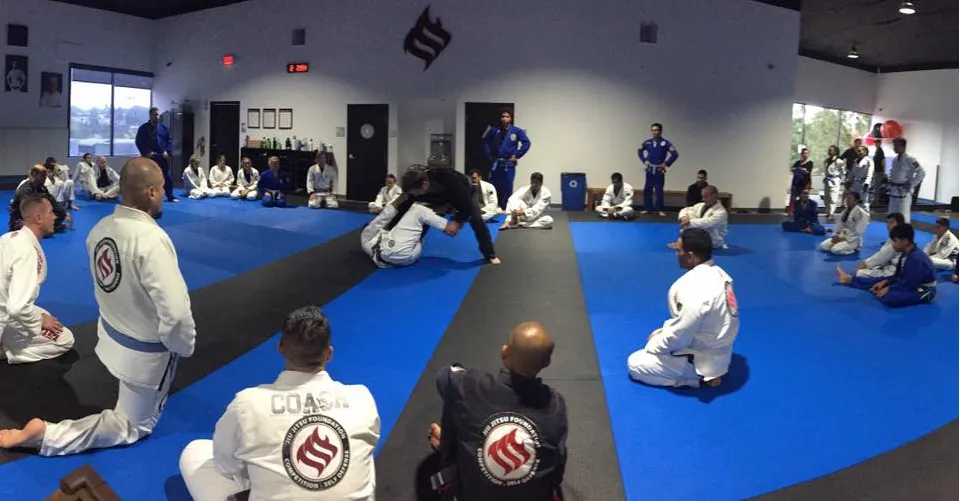

The details followed the same system.
Certificates, cards, patches, and other academy materials extended the same visual language into the smaller pieces around the brand.


One identity, across the whole academy.
Jiu Jitsu Foundation remains an active academy. The identity Keeks created was built to work across its original website, physical space, signage, apparel, training gear, products, certificates, and academy materials.
The result was a visual system that could stay recognizable across very different applications without relying on the martial-arts clichés the project was designed to avoid.
The engagement was a defined project, and it ended as one. Keeks delivered the identity. The academy trains under it.