The Sandwich Spot
Building a San Francisco restaurant identity across storefront, menu, apparel, and web.
Industry
Restaurant / food & beverage
Engagement
Brand identity, signage, apparel & website
Relationship
Defined project, delivered and handed off
Location
Marina District, San Francisco
Scope
Brand strategy, identity, illustration, signage, menus, apparel, collateral, website design and development, and restaurant brand applications
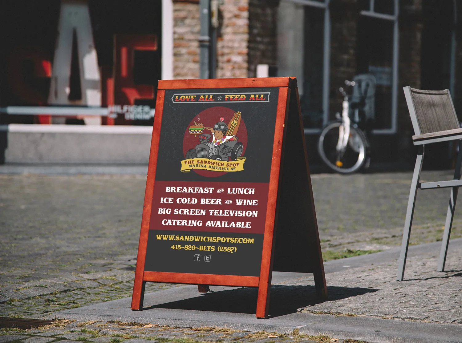
The restaurant had a location. The brand still needed a point of view.
The Sandwich Spot was preparing its Marina District location with a restaurant to build around, but no distinctive visual identity for the San Francisco market.
Keeks created the brand around the classic-car, tattoo, surf, and Bay Area influences surrounding the location, then carried it across the storefront, menu, signage, apparel, collateral, and website.
The Sandwich Spot built and operated the restaurant. Keeks built the San Francisco brand and the customer-facing visual system around it.
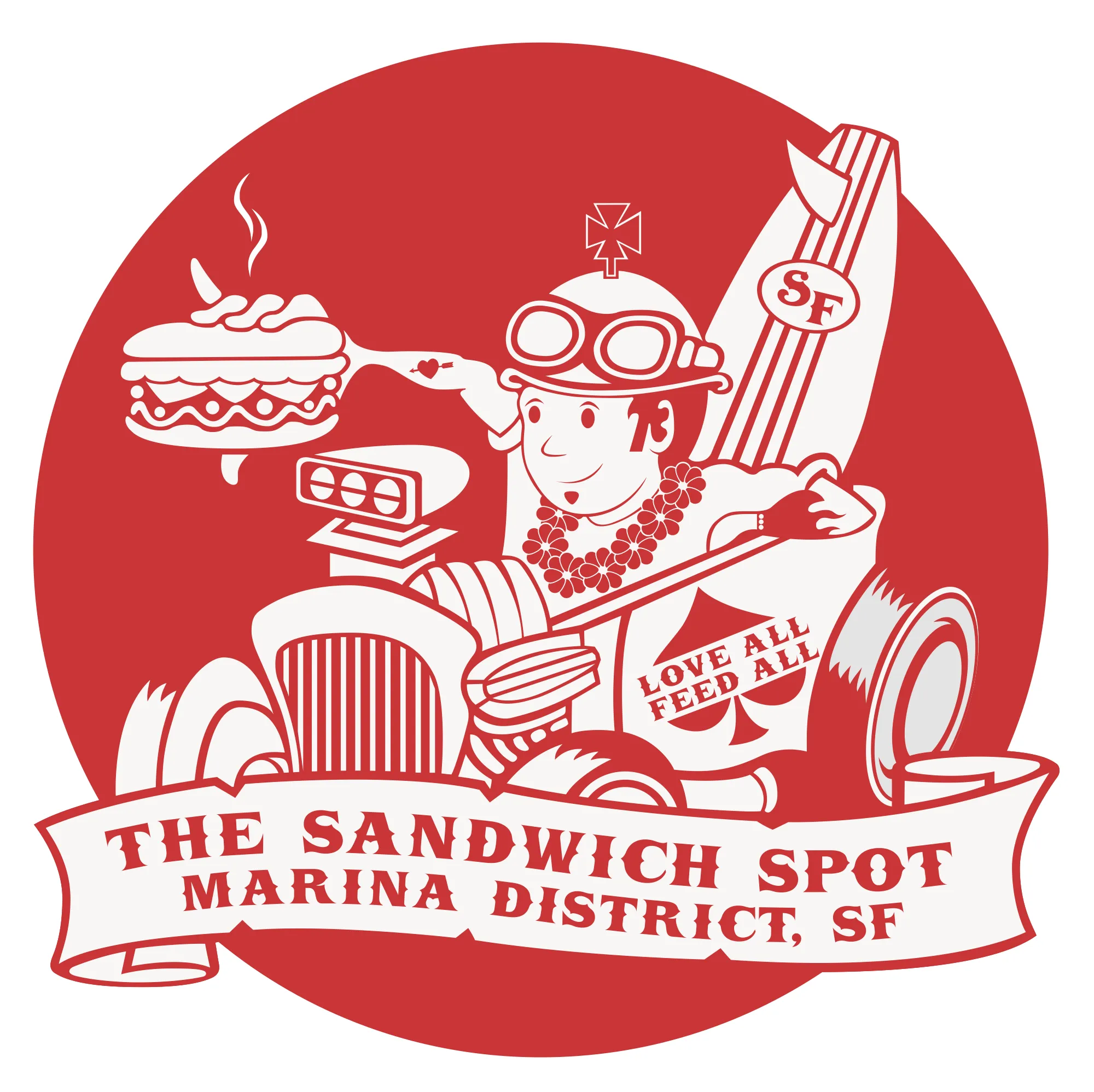
One identity, from the street to the screen.
Four stages show how a Marina District location became one identity carried across signage, apparel, and the website. Each stage built on the one before it.
- 01The locationA Marina District restaurant preparing to establish its own identity.
- 02The brandIllustration, logo, typography, color, and visual language.
- 03The restaurantSignage, menu, apparel, collateral, and physical applications.
- 04The digital experienceWebsite and restaurant information carried into the same visual world.
The identity had to feel local without becoming a costume.
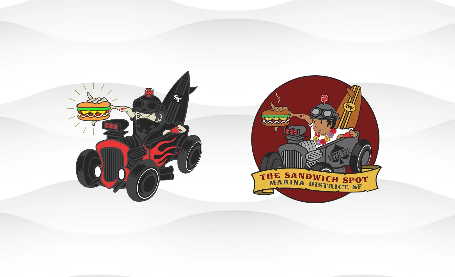
Classic cars, tattoo graphics, surf culture, and Bay Area references all shaped the direction. The challenge was bringing those influences together without turning the restaurant into a collection of disconnected themes.
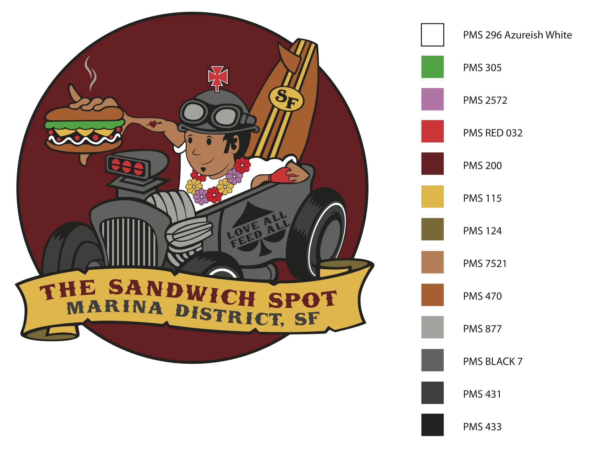
Keeks created the illustrated mark, typography, color, and graphic language that became the center of the brand.
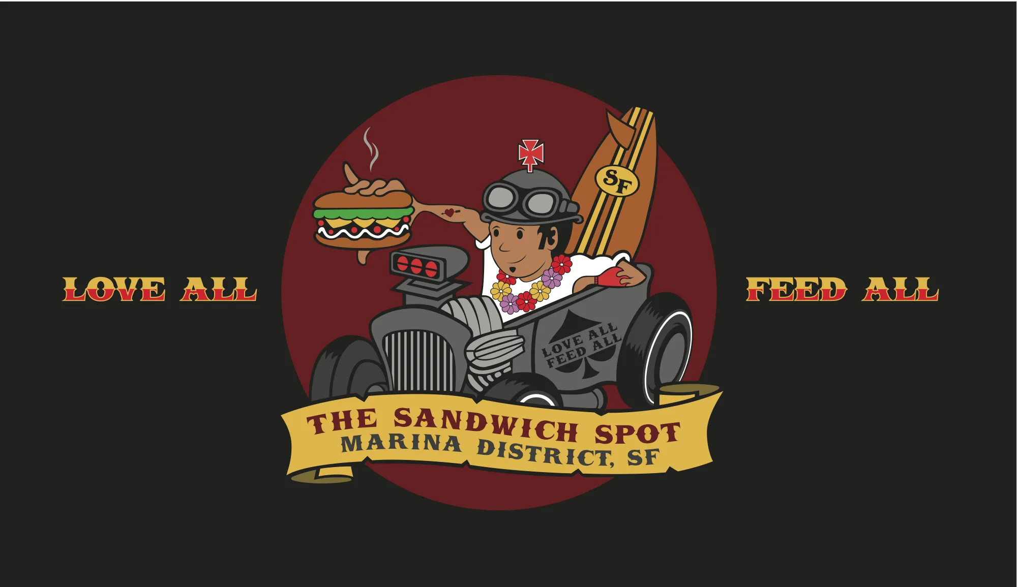
The brand had to read from the street.
Keeks carried the identity into the exterior sign, sidewalk signage, and restaurant environment so the same visual character people saw online was present before they walked through the door.
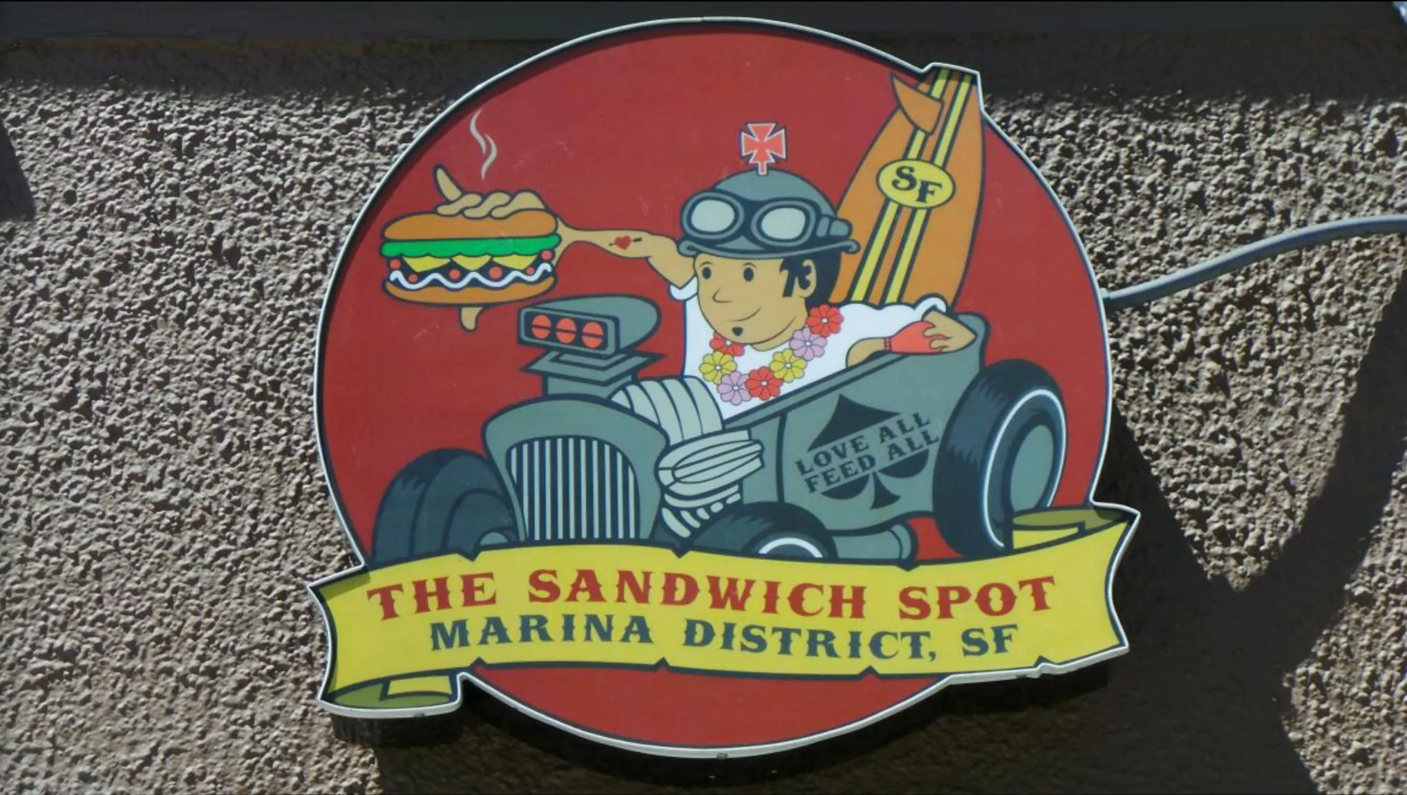
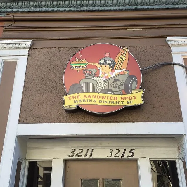
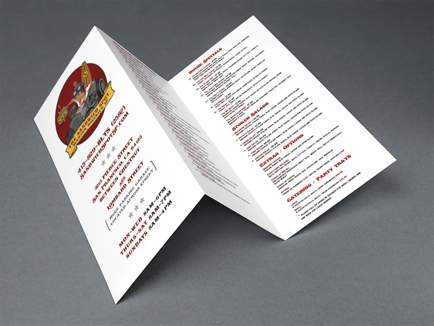
The same language carried onto the table.
Menus, business cards, stickers, and other small-format pieces brought the same illustration and graphic language into the details customers handled directly.
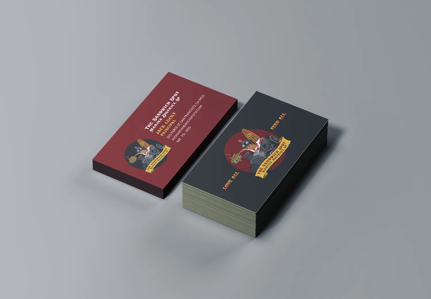

Built to work beyond the storefront.
The graphic system extended naturally into apparel and other physical applications.
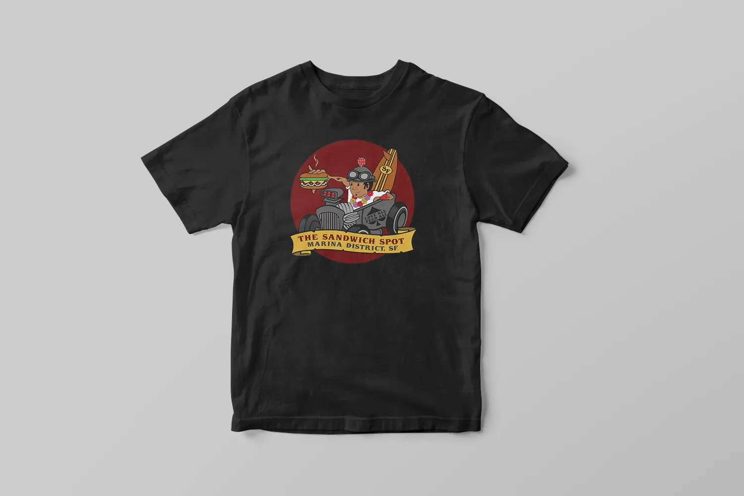
The website stayed inside the same visual world.
Keeks designed and developed the website using the same illustration, voice, menu language, and graphic character established in the physical restaurant.
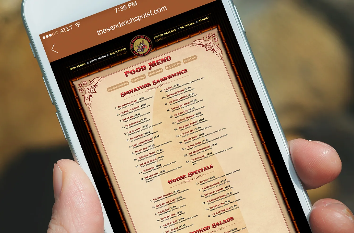
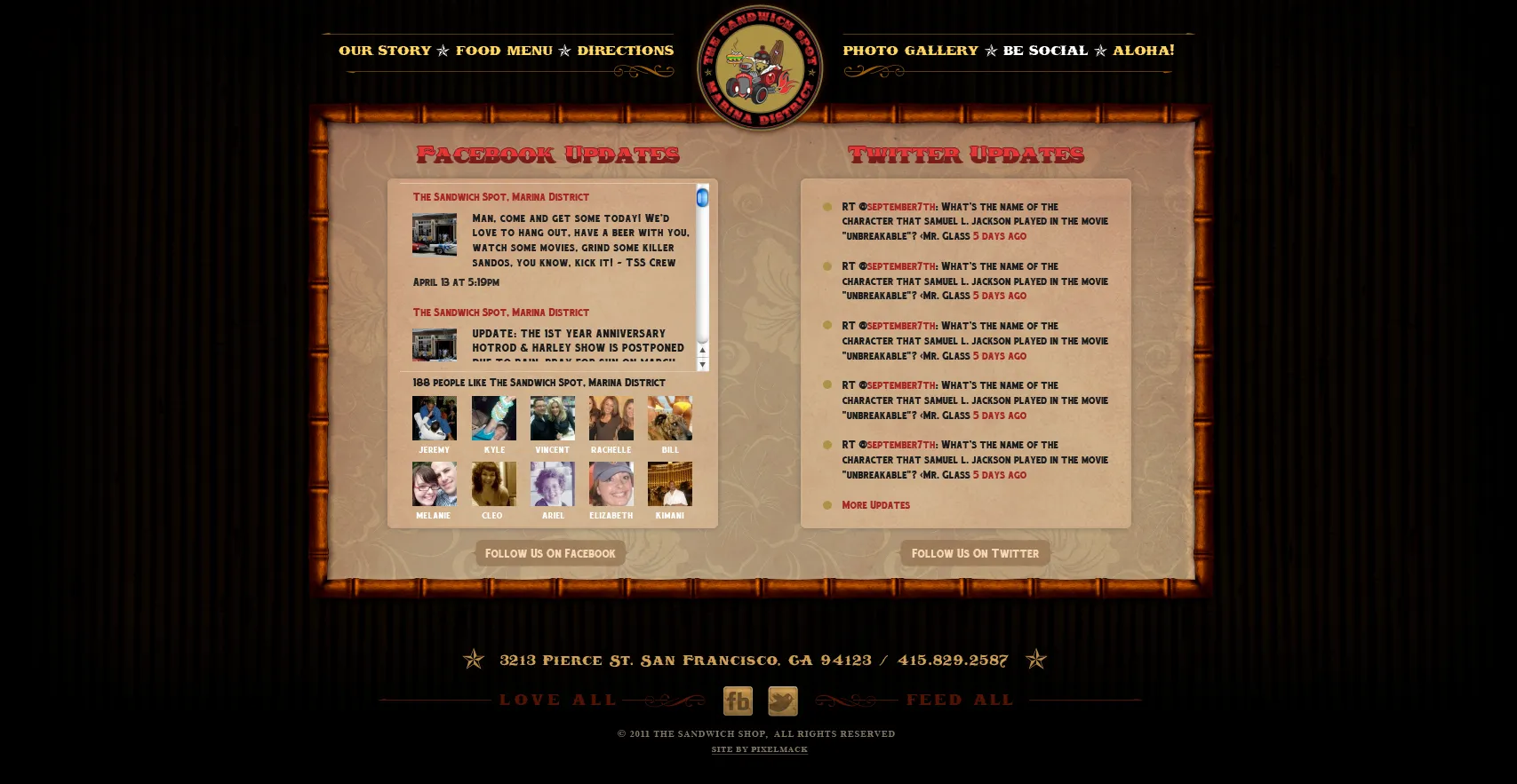
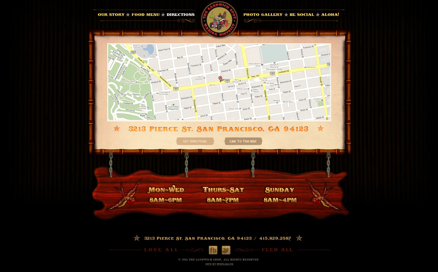
One restaurant. One recognizable visual world.
Keeks built the Sandwich Spot San Francisco identity and carried it from the storefront and menu to apparel, collateral, and the website.
The applications changed. The character stayed recognizable.
The engagement was a defined project, and it ended as one. Keeks built the identity. The restaurant made it its own.