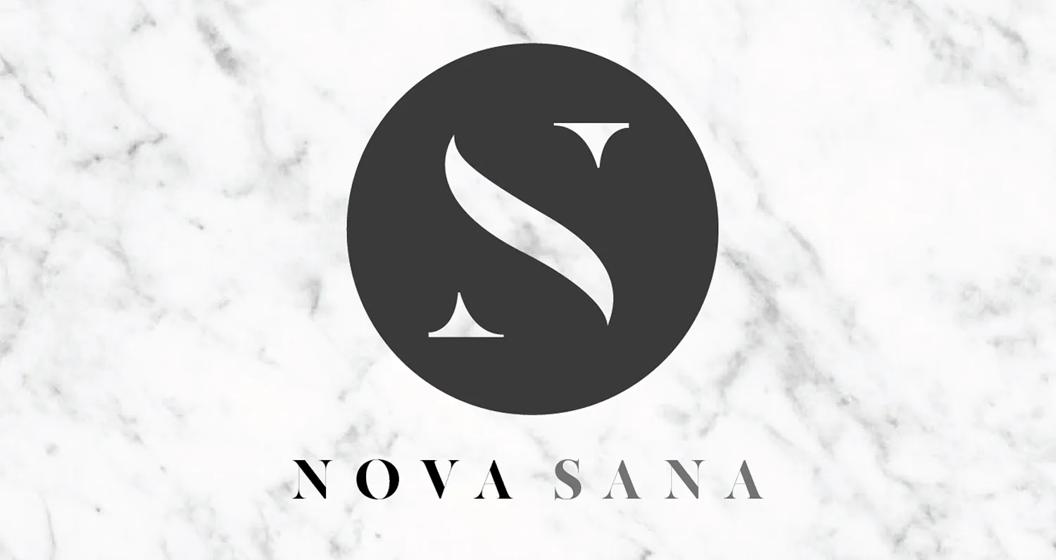
Nova Sana
Building a wellness brand from the name on the door to the products on the shelf.
Industry
Wellness / bodywork / consumer products
Partnership
Two years
Relationship
Brand, digital, space, photography, and product partner
Status
Engagement complete; the business has since changed hands. Shown as designed and built during the partnership.
Scope
Naming, identity, website and copy, photography, space and signage, marketing materials, product naming, packaging, labels, product copy, and product photography
The idea existed. The brand did not.
Nova Sana began with a bodywork concept and a physical location. Before it could become a public-facing business, it needed the things people would actually encounter: a name, an identity, a way to understand the service, a website, a physical environment, and a reason for all of those pieces to feel like the same company.
Keeks built that system. What started with naming and identity expanded across the space, photography, website, marketing materials, and eventually a line of wellness products.
Nova Sana owned the methodology, services, and underlying product decisions. Keeks built the brand and customer-facing experience around them.
One brand, expanding with the business.
- 01Name itA company name, identity, voice, and visual language.
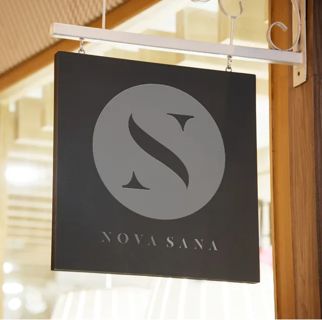
- 02Make it physicalSignage, environmental applications, branded materials, and the space itself.
- 03Make it understandableWebsite structure, copy, photography, and the public client experience.
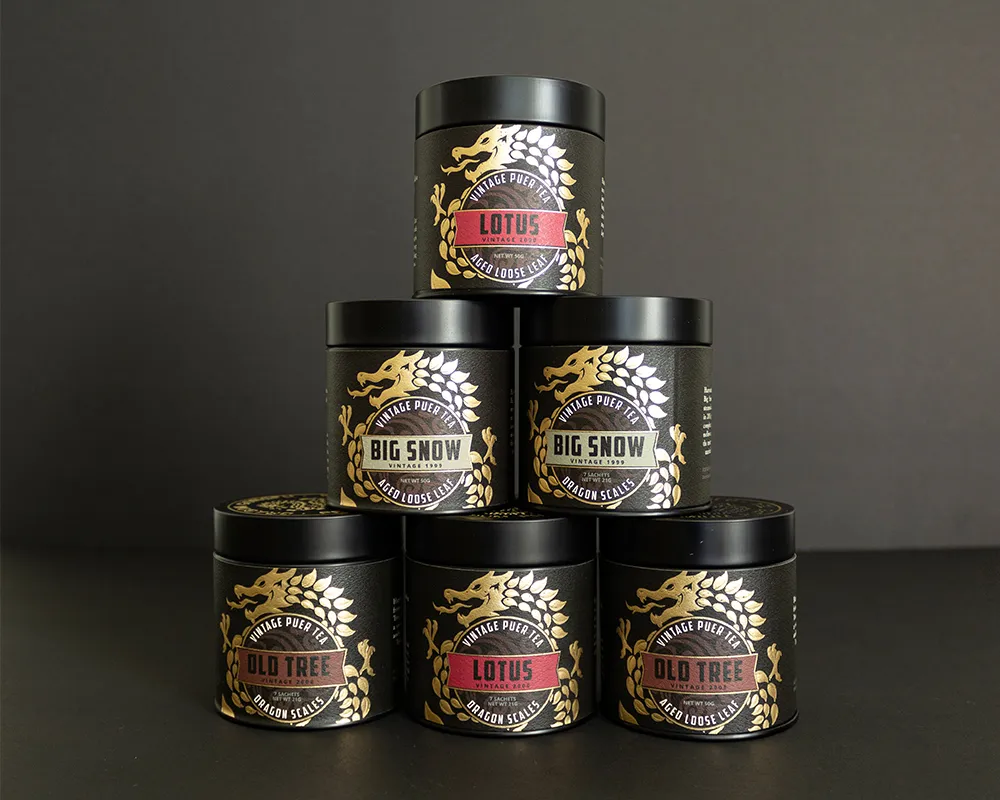
- 04Extend it into productsProduct naming, labels, packaging, photography, and sales materials.
A name people could remember, and a system that could carry it.
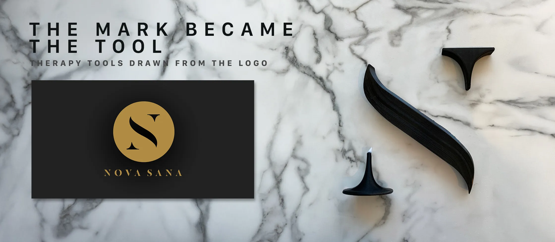
Nova Sana needed to feel calm and considered without disappearing into generic wellness language. Keeks developed the name and identity, then built the typography, color, layout, voice, and visual direction around it.
That system had to work far beyond a logo. It moved onto signage, stationery, apparel, printed materials, digital surfaces, and eventually products.
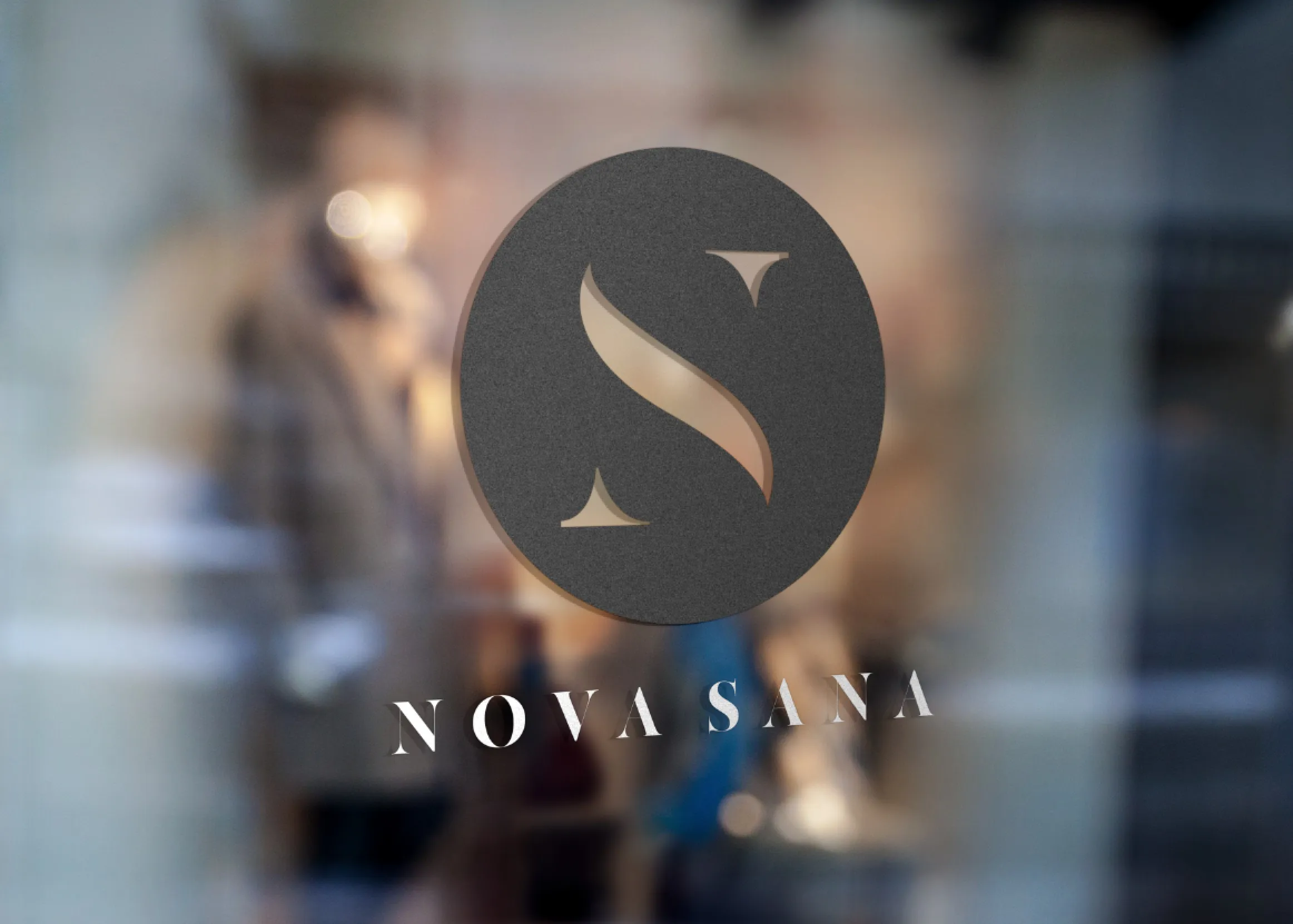
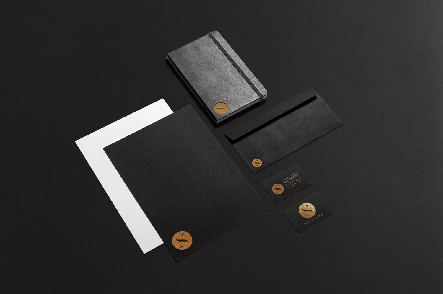
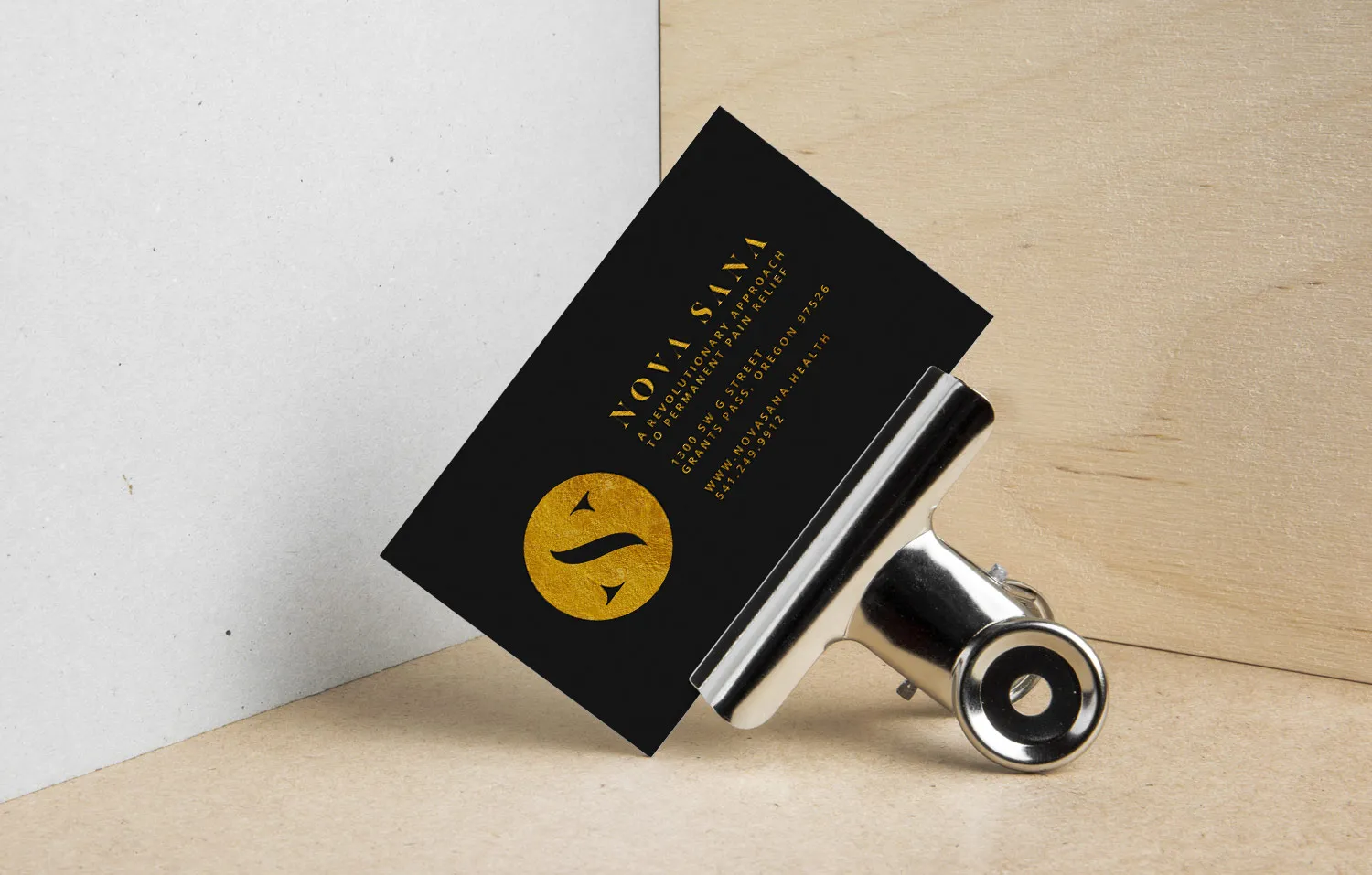
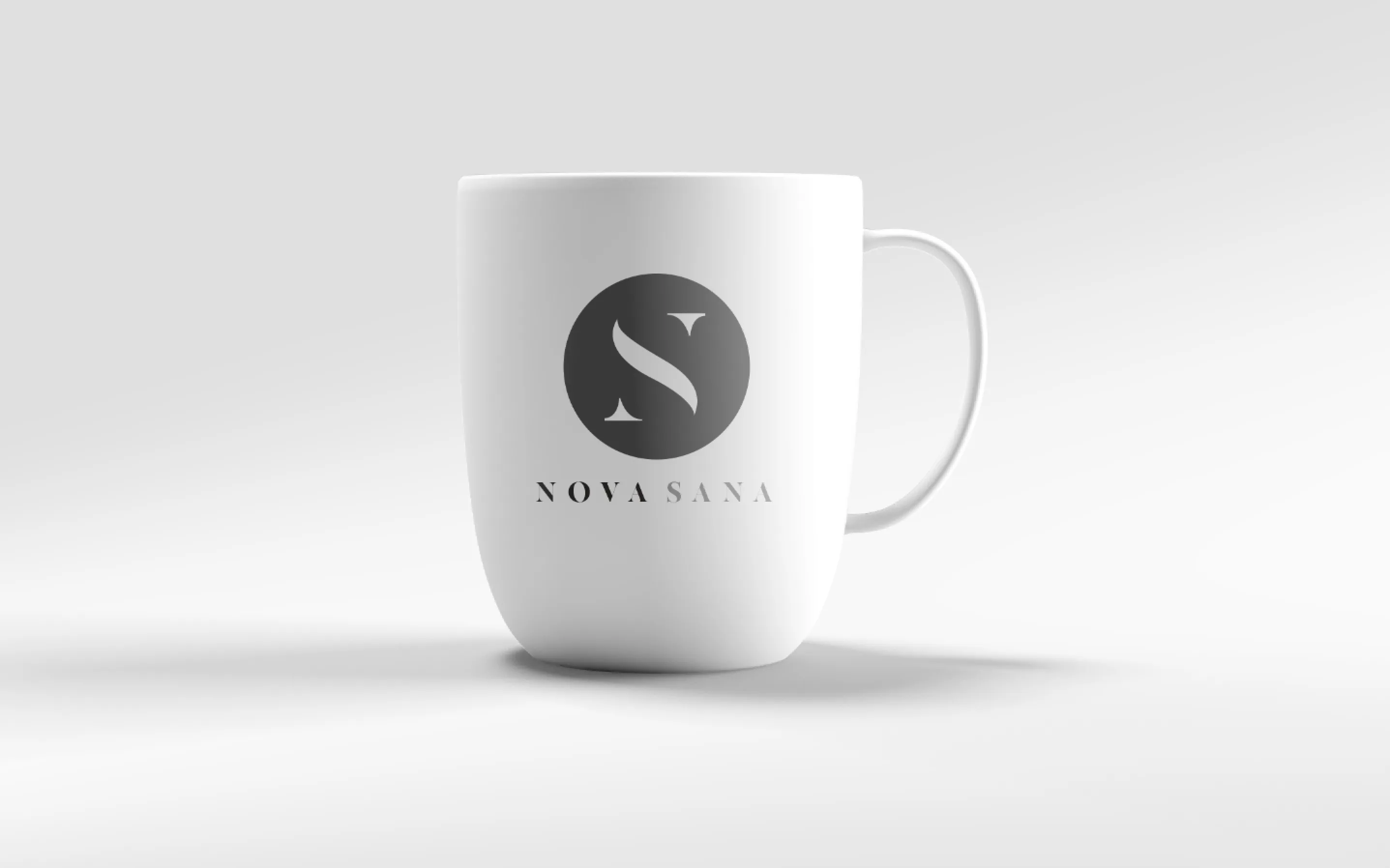

The brand had to work before anyone read the website.
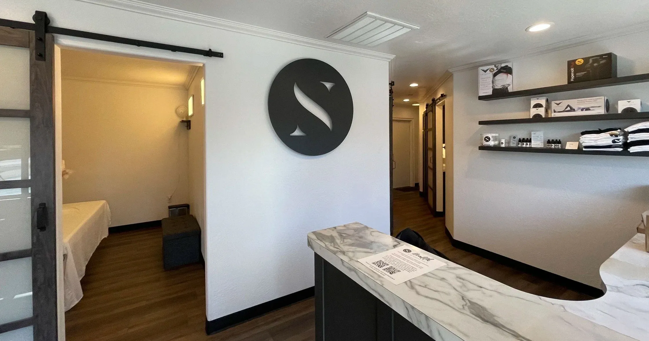
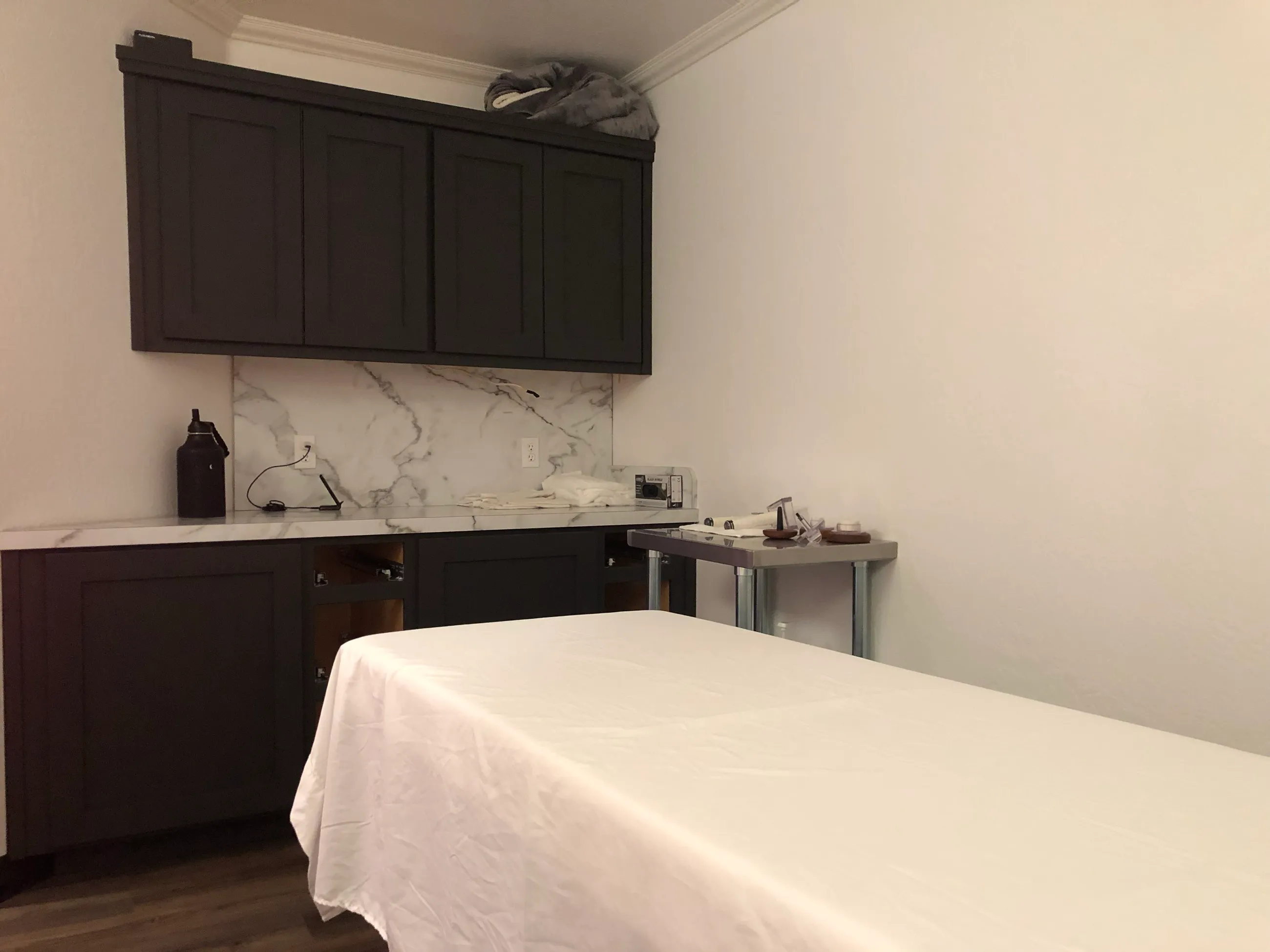
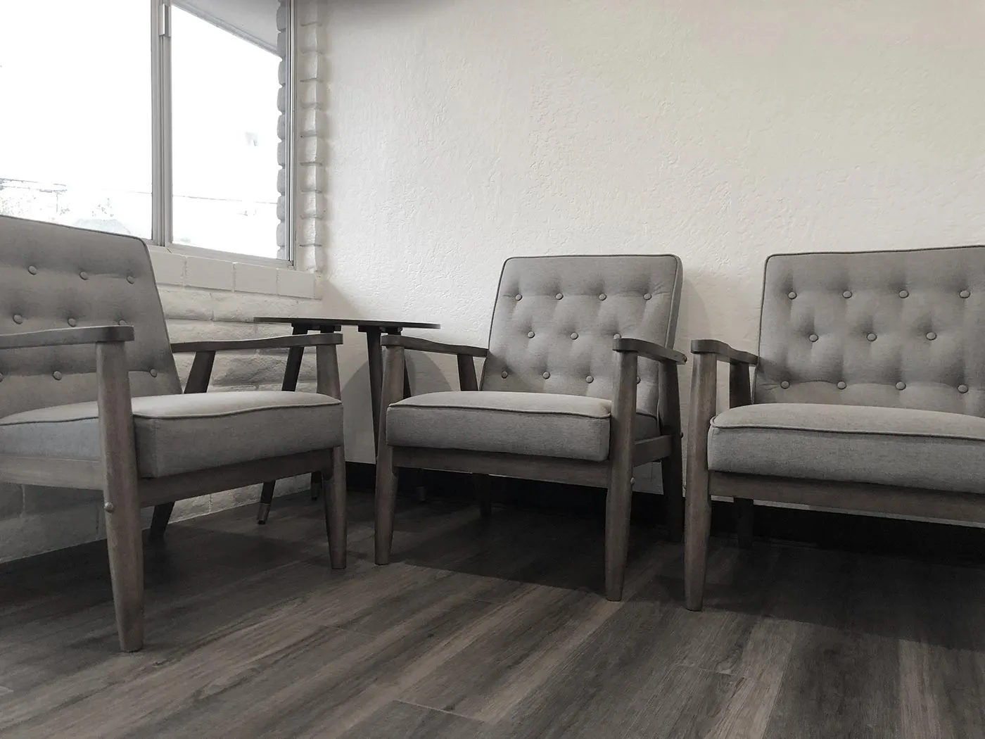
Nova Sana was a physical experience first. The reception area, treatment rooms, signage, branded details, and materials all had to make the same company visible.
Keeks helped shape those customer-facing touchpoints and photographed the finished environment. That photography then became part of the website and marketing, so the digital brand came from the real place rather than a separate visual world.

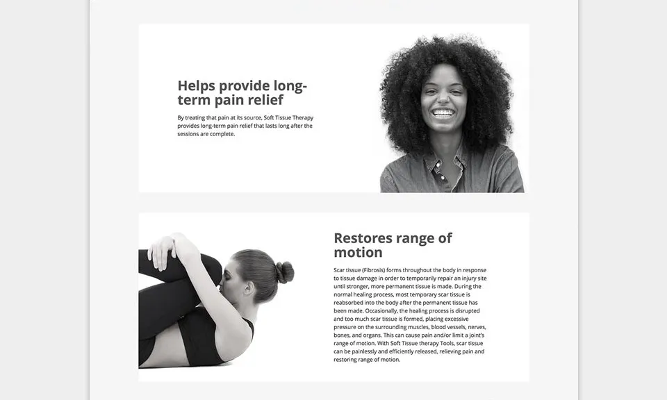
The website had to make an unfamiliar experience understandable.
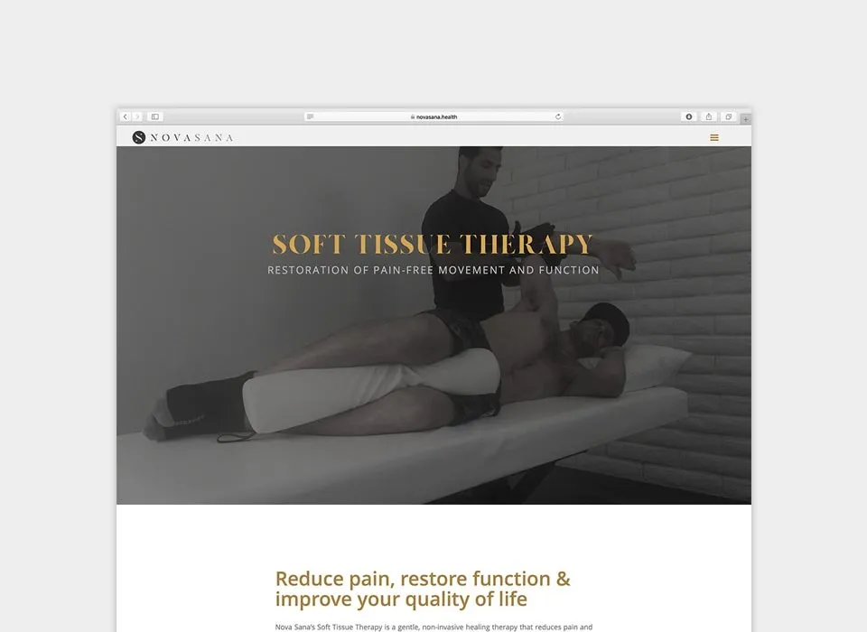
Keeks designed the site structure, wrote the customer-facing copy, and built the visual story around original photography from the space.
The job was to make the concept legible before a visit: what Nova Sana was, what the experience looked like, and how someone could take the next step.
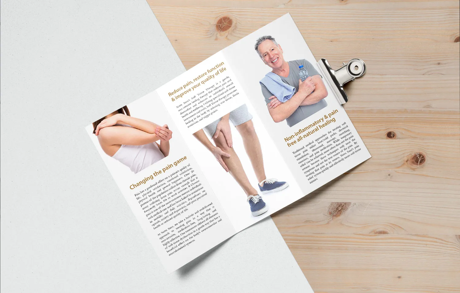
The brand moved from the treatment room to the shelf.
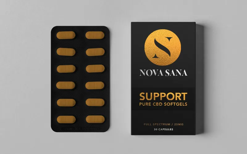
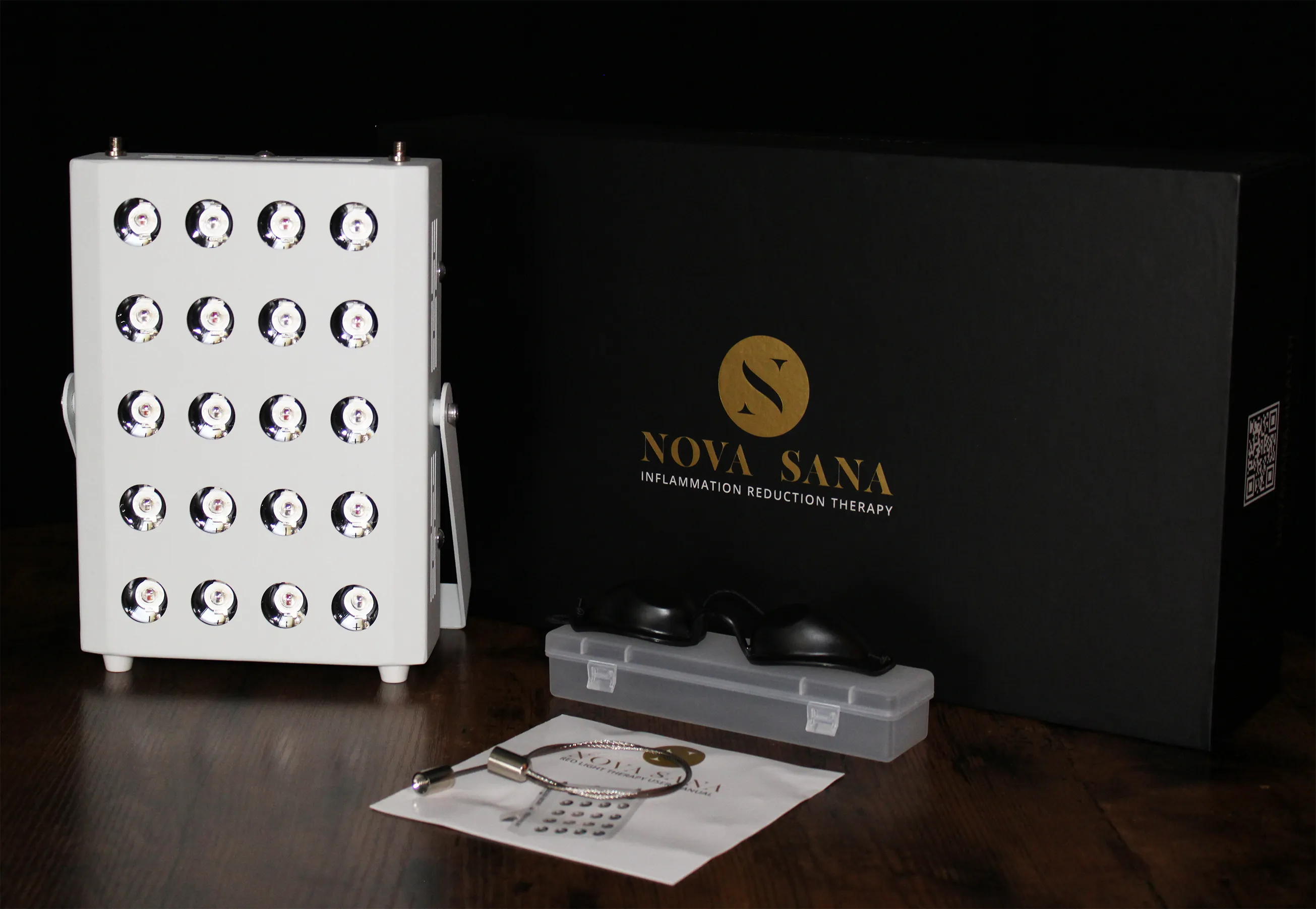
As the business evolved, Nova Sana began putting more emphasis on consumer wellness products. The brand needed to stretch into something a customer could hold without feeling like a second company.
Keeks carried the system into product naming, labels, boxes, inserts, product copy, photography, and presentation materials. The same visual language that began in the space now had to work at product scale.


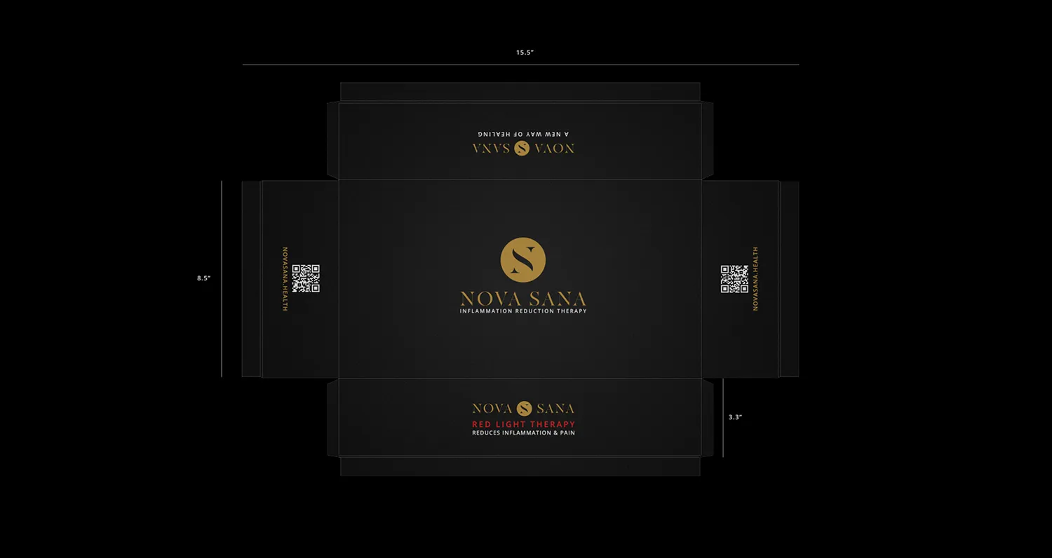

The business changed. The brand was built to move with it.
Over two years, Nova Sana evolved from a service-led concept toward a more product-focused model. The work changed with it, but the foundation stayed consistent: one name, one identity, and one visual language carried across the space, website, photography, packaging, and customer-facing materials.
Nova Sana has since changed hands. The work here is shown as it was built.