EcoChi
Building the brand for a wellness-focused interior design practice rooted in sustainability, nature, and a distinct design philosophy.
Industry
Interior design & wellness
Engagement
Brand identity & creative system
Relationship
Defined project, delivered and handed off
Status
Brand system delivered
Scope
Identity, book design and illustration, signage, invitations, packaging, branded materials, and the EcoChi 180° Seal
The idea was already there. The brand wasn’t.
EcoChi began as a defined approach to interior design, bringing together classical Feng Shui, sustainability, wellness, and environmental psychology. It had a name and a point of view about how spaces should make people feel, but no visual language around it.
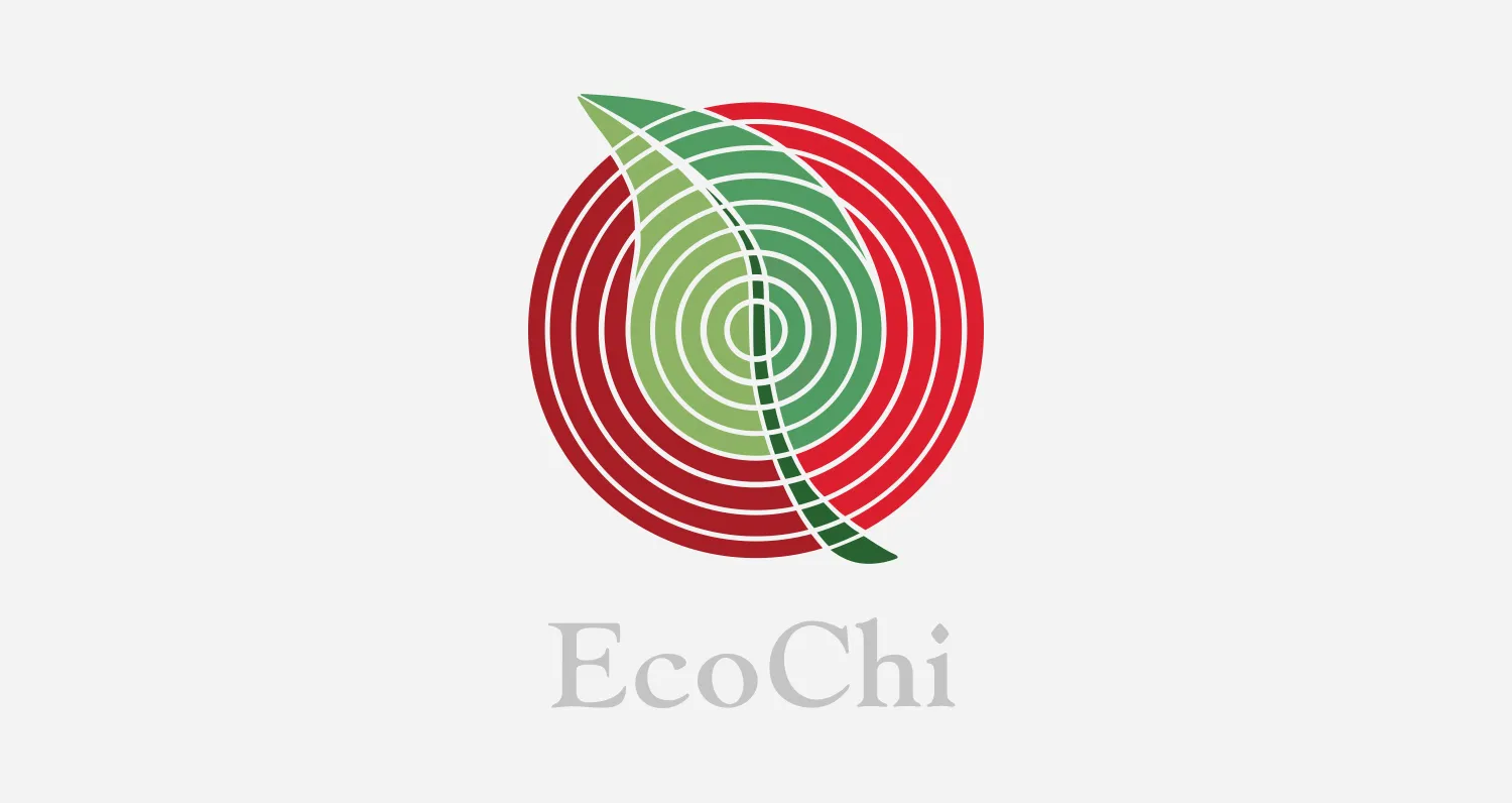
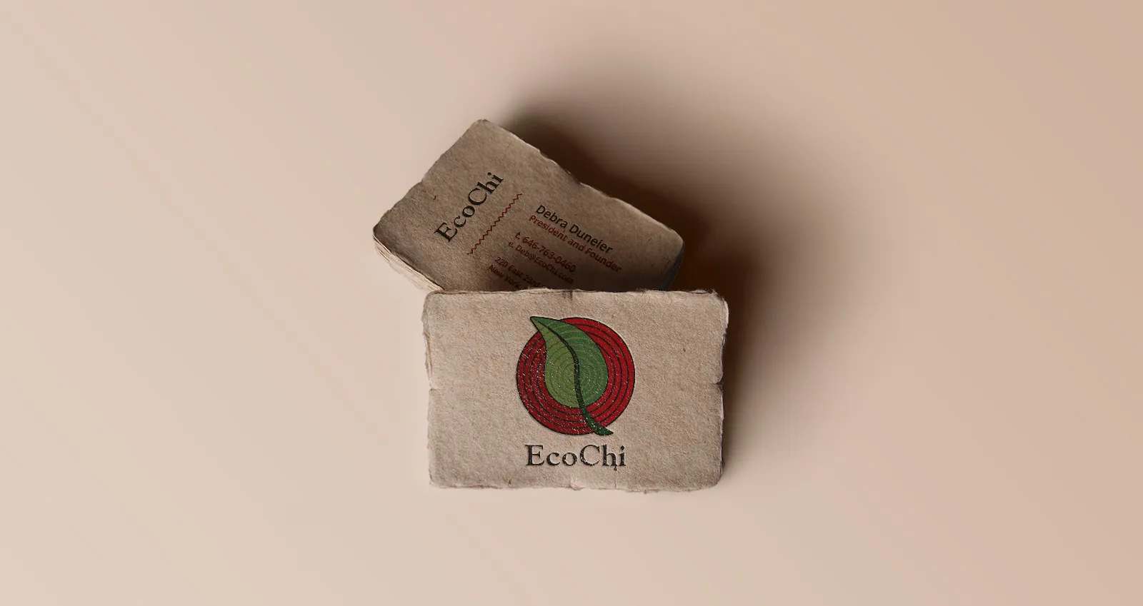
Keeks translated those ideas into the brand through organic forms, typography, color, and tactile materials, then carried that language across the book, signage, invitations, packaging, branded materials, and the EcoChi seal.
EcoChi developed the practice and its methodology. Keeks developed the visual language that made it recognizable.
From an idea to a complete visual language.
- 01The ideaA name and a defined approach to designing for people, place, and well-being.
- 02The brandLogo, wordmark, typography, color, and material language.
- 03The bookCover design and original illustration.
- 04The applicationsSignage, invitations, packaging, branded materials, and the EcoChi 180° Seal.
Nature shaped the visual language.
EcoChi’s work centered on the relationship between people and the spaces around them. Sustainability, natural elements, wellness, and environmental experience were part of the practice itself, so the brand needed to express those ideas rather than simply describe them.
Keeks built the visual language around organic forms, custom typography, color, recycled materials, and physical texture. The result was a brand that felt connected to the natural environments and values behind EcoChi’s work.
The visual language continued into the book.
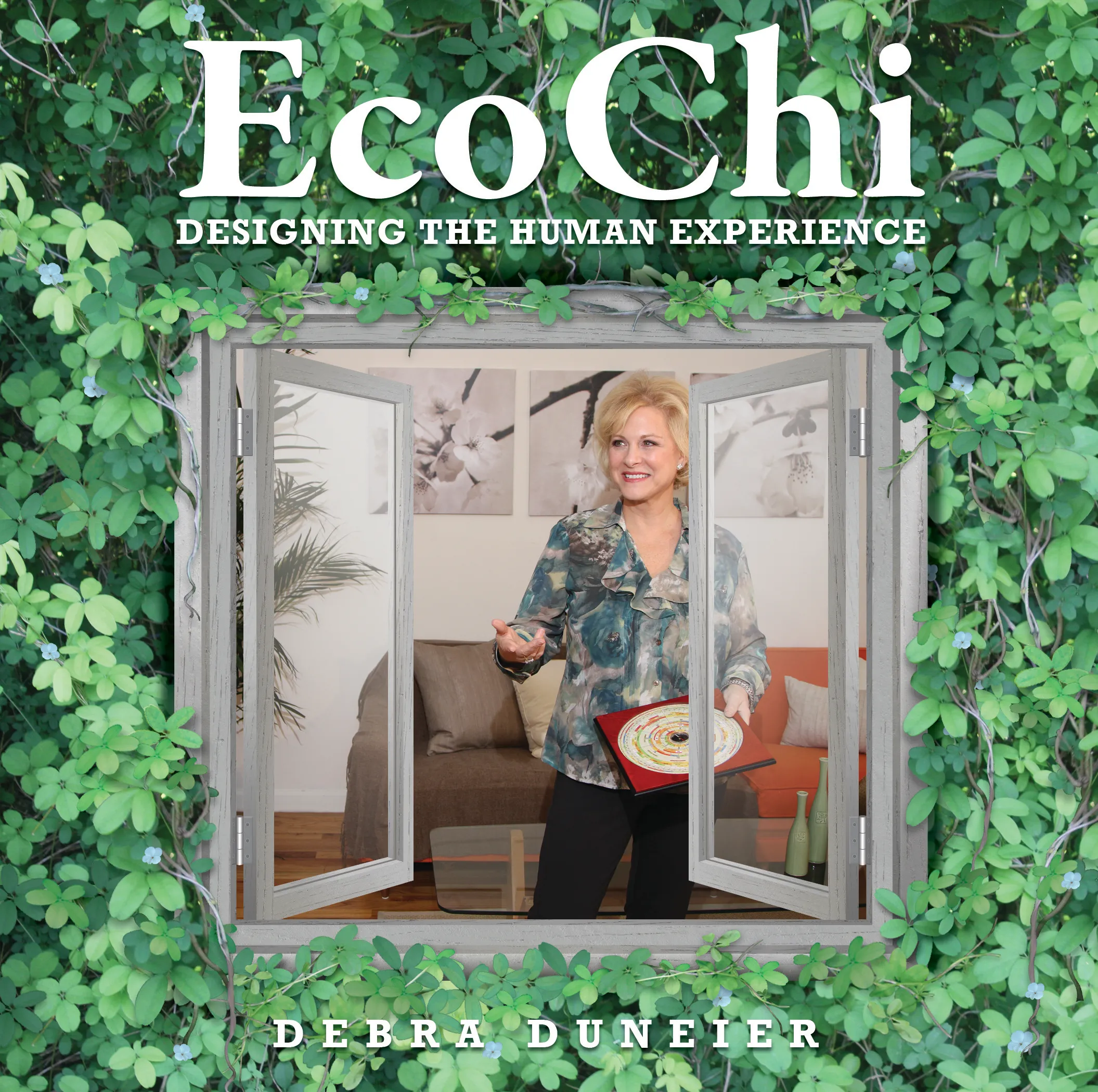
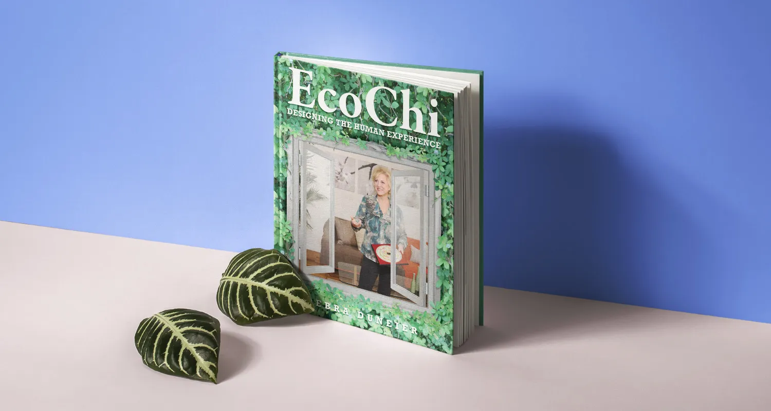
When EcoChi published EcoChi: Designing the Human Experience, Keeks designed the cover and created the illustrations. The book gave EcoChi’s methodology a new format and gave the brand one of its most substantial physical expressions.
The same visual language carried into the publication while allowing the book to stand on its own.
The brand became part of the environment.
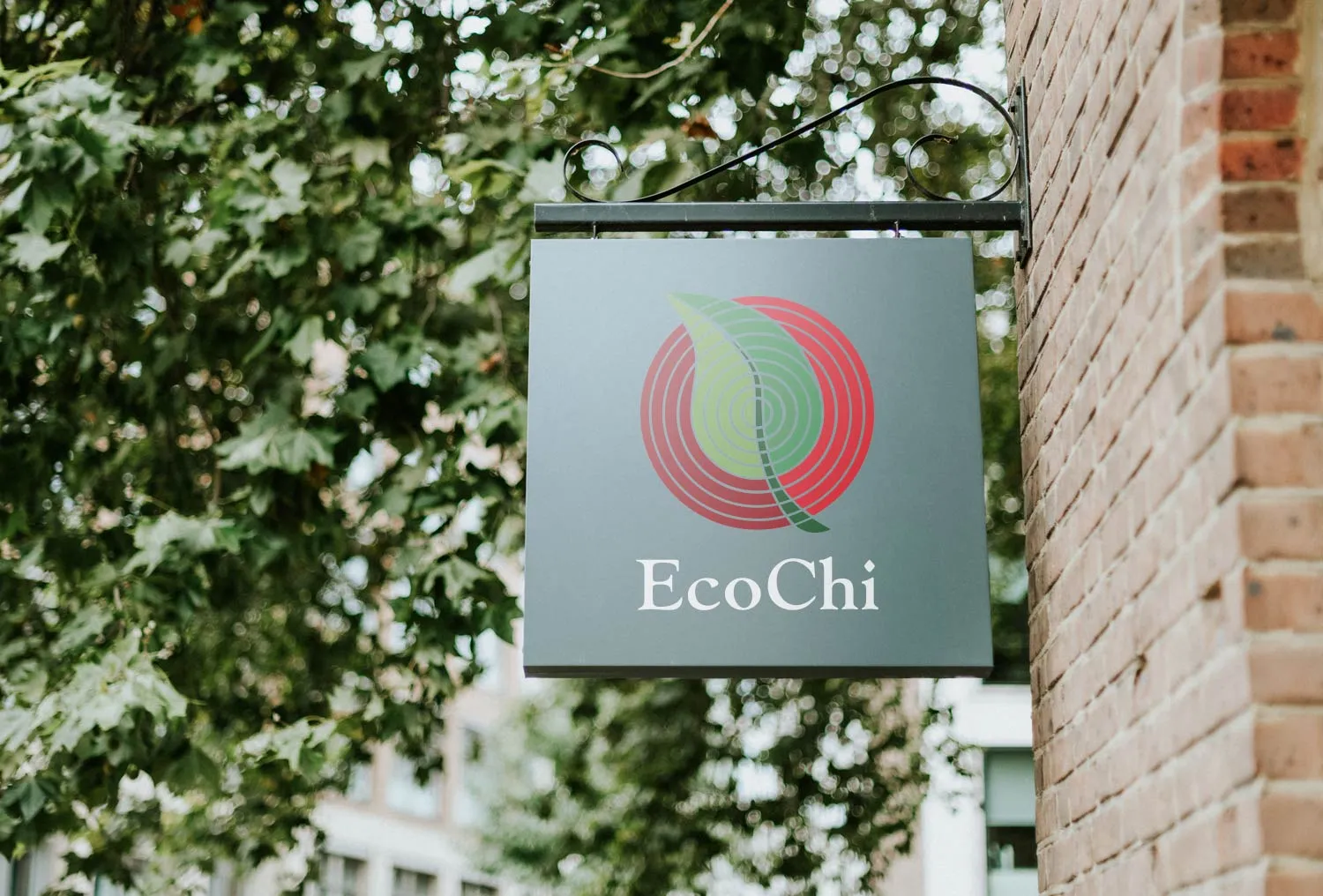
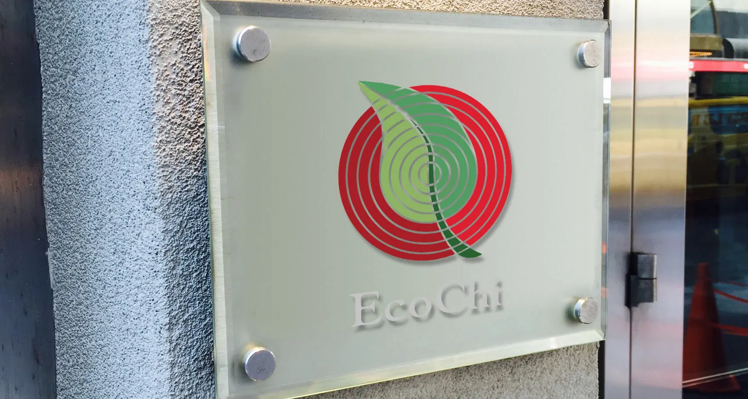
Keeks designed office and entrance signage that brought the EcoChi brand into the physical space.
For a practice built around the effect environments have on people, the brand could not live only on paper. It became part of the places where people encountered EcoChi.
The certification needed a mark of its own.
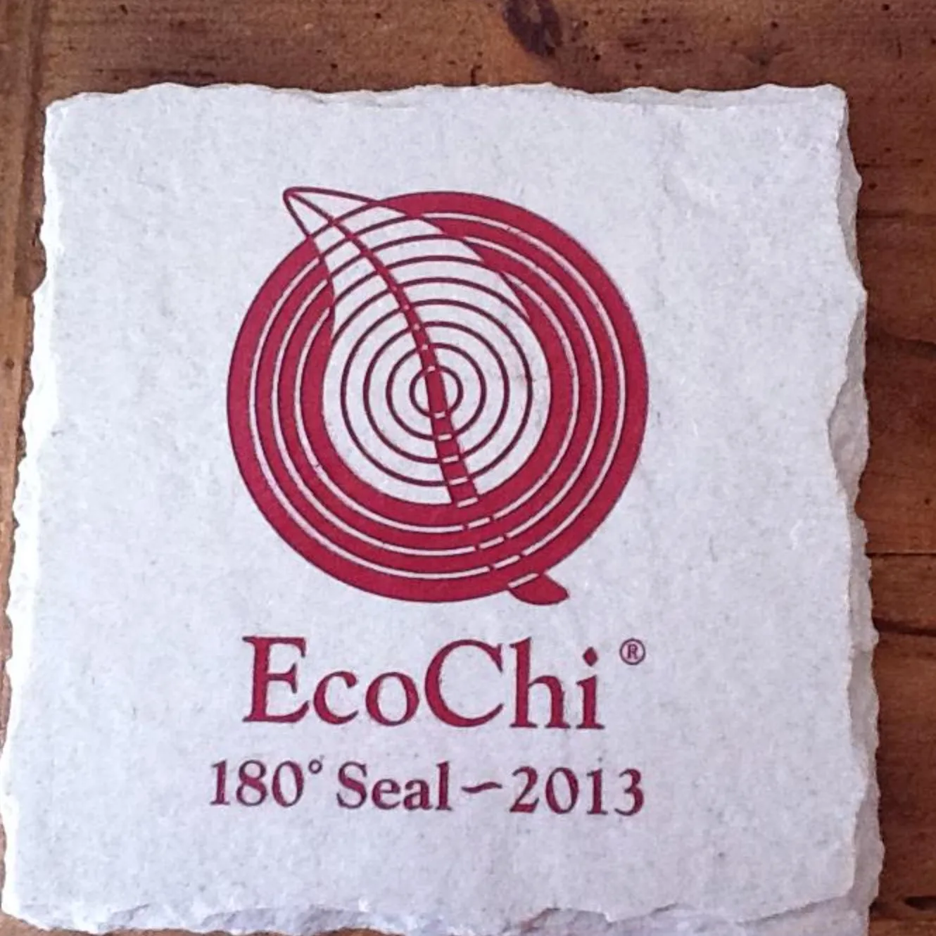
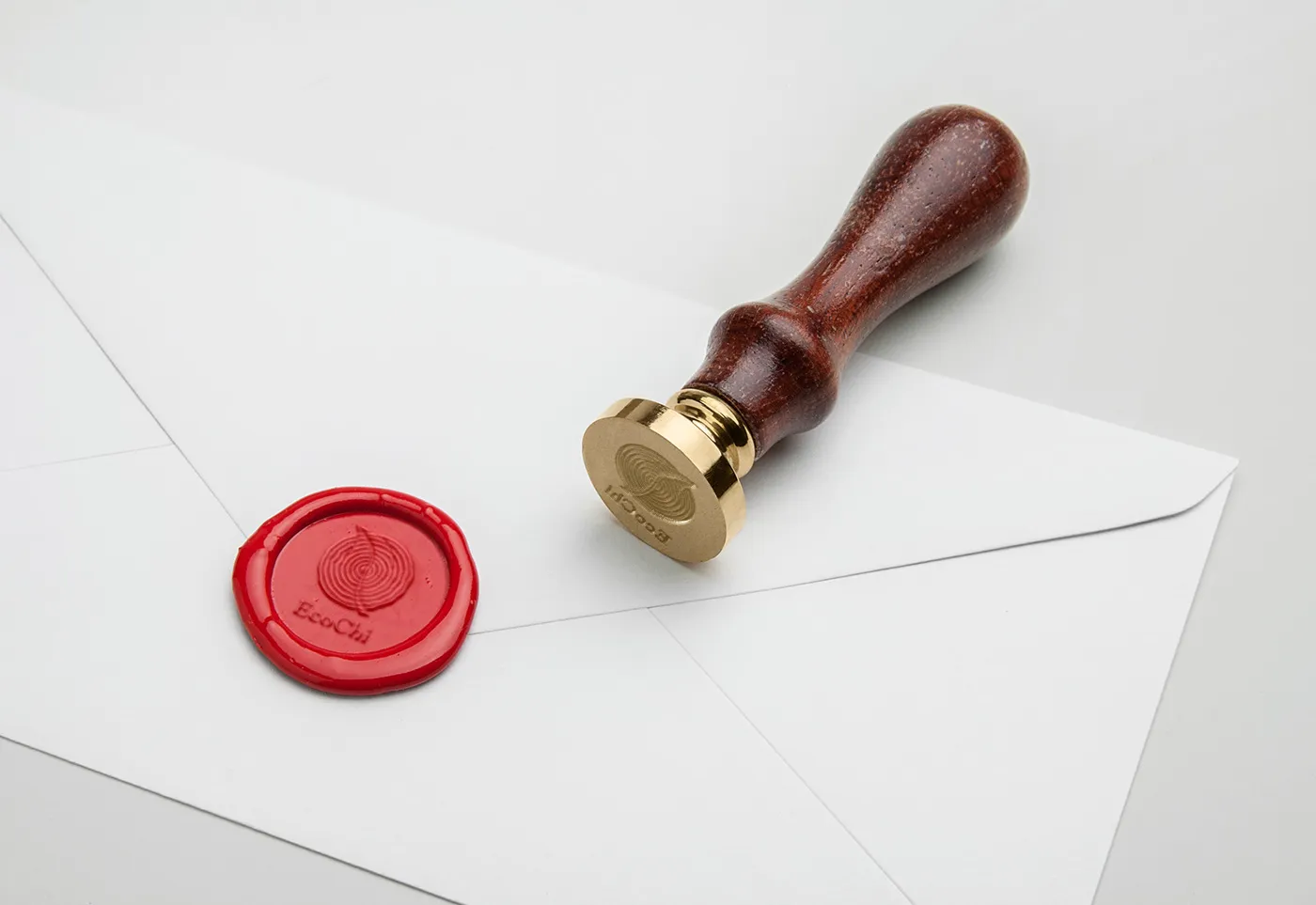
EcoChi’s 180° Certification recognizes properties that complete its sustainable, experience-focused certification process. Keeks designed the EcoChi 180° Seal, the mark awarded to those properties.
The seal needed to function as its own recognizable object while still feeling unmistakably part of the EcoChi brand.
The materials mattered too.
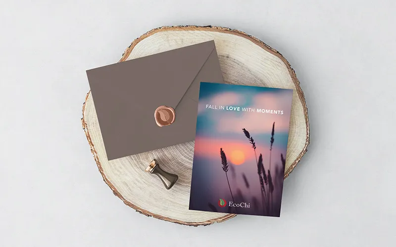
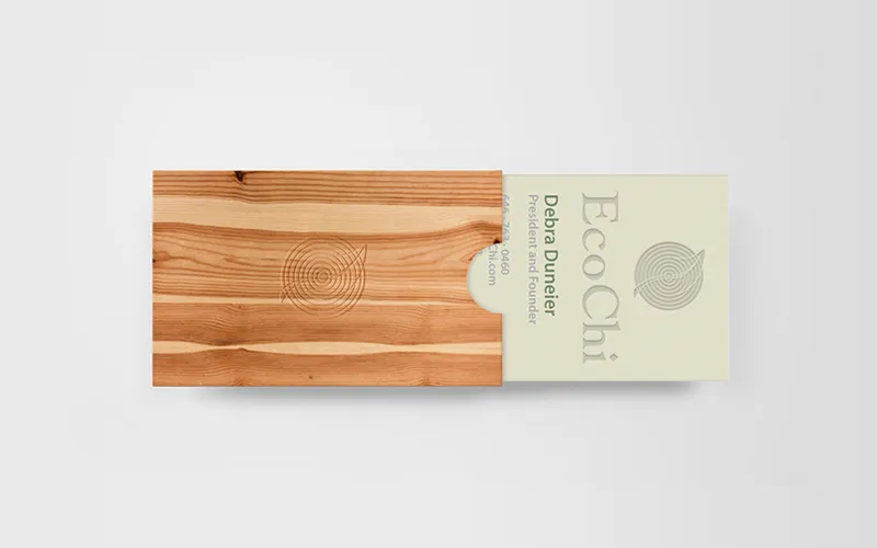
Invitations, door hangers, packaging, gift materials, and other branded pieces extended the same visual language into the smaller moments around the business.
Recycled materials, tactile surfaces, organic forms, and restrained use of color gave those pieces a physical connection to the ideas EcoChi brought into its spaces.

A name and an idea, made recognizable.
EcoChi began with a defined philosophy but no visual language of its own.
Keeks turned those ideas into a brand that looked, felt, and behaved like the practice behind it.
The engagement was a defined project, and it ended as one. Keeks delivered the language. The philosophy it expresses is EcoChi’s.